I’ve been a satisfied customer of this app for a long time now, but the new, “upgraded” this app app is a downgrade in every single conceivable way. I have no idea what on earth would possess them to roll out this new app.
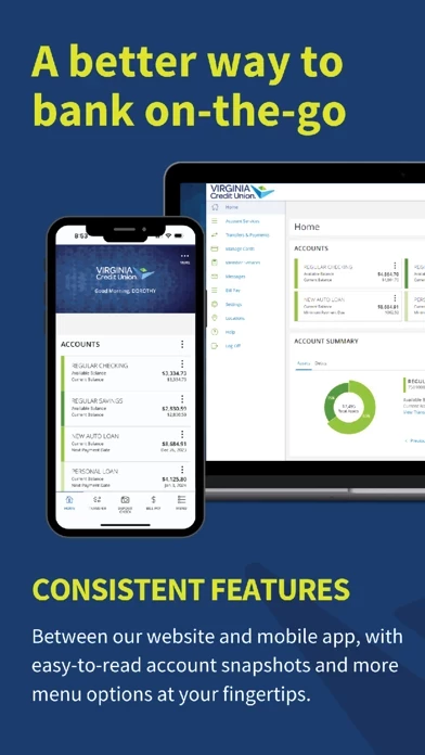
First, appearance: the new app looks like a website from 2008. The text is way too small, and everything feels very… angular, for lack of a better word.
APPS AREN’T MEANT TO BE WEBSITES! If I wanted to use the website, I’d just log on in my browser!
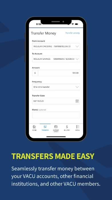
Second, functionality: this is where the new app sincerely disappoints. On the old app, I could see my credit card balance and transfer the appropriate funds in like 2 clicks. It took me FOREVER to figure out how to pay my balance in the new app, and I only finally figured it out because one of their “hints” popped up at the top of the screen that detailed the ridiculously unintuitive way to make the transfer.
(Now you have to hit menu > transfers and payments > credit card and loan payments > then enter the information > submit. That may not seem like a lot, but it’s not intuitive and I probably would have never figured it out if not for the “hint” that appeared.)
I sincerely HATE the new app. I am sorry to whomever designed it, because I’m sure it took some time, but I just cannot understand why they would create an objectively worse user experience when the previous one was fine.