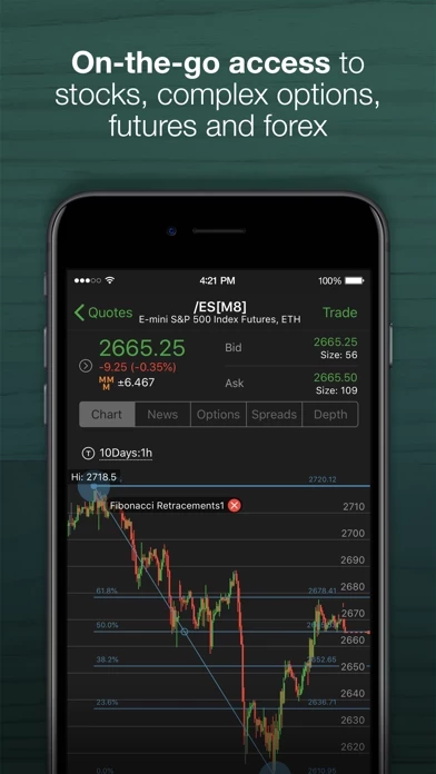
I look at my page, and am overwhelmed. I had a Scottrade account specifically because it was a better page. An “account manager” from TD called me to see if I was happy. Good for them (no sarcasm). Of course, I knew that it was to stimulate trading on my end. I told her that I would trade much more if the page was much simpler and more intuitive. It is difficult for me to believe that this site was ever actually tested on a focus group. If it was, maybe I’m wrong. At best, however, the focus group would have had to have been made up of highly motivated and extremely active traders where somehow THEIR specific proclivities, i.e., ludicrous color integration (purple, blue with red and green) and an unorganized mess of columns and rectangles constituted a stimulation of trading. For me, it’s an unpleasant color wheel spun into a mess. Hire a stylist! Give your customers options on what kind of start page. ASK us what WE want. Honestly, you’re pretty close to losing me to Fidelity, as it is. BUT, I’m a loyal guy, and am hoping that I might get listened to, this time. Cheers!

