I am an iOS user. For some reason, the keyboards doesn’t work. Either I have to touch several times to pop up the keyboard, or cancel EBLSKYBANKING altogether. The icons, UI is good, but not the UX. I just made a transaction, and I can’t see it on the dashboard. Rather I don’t even know where to find the history. The offer tabs take a whole lot space, where the features tabs are small. Shouldn’t it be the opposite? And don’t even start on creating all the beneficiaries altogether. You already have the beneficiaries. It seems the developers forgot there’s something called data migration. I had to find all the information again to create them all. You already had my skybanking user ID, why I had to create a new one? Due to keyboard problem, the user ID created was a mess. EBLSKYBANKING transition isn’t smooth at all. Plus sometimes the data in previous fragments/segue gets erased. You guys totally forgot about deployment scaling. It took me 15 minutes altogether to accomplish the KYC.
And why the wait icon is a ripoff of google cloud?
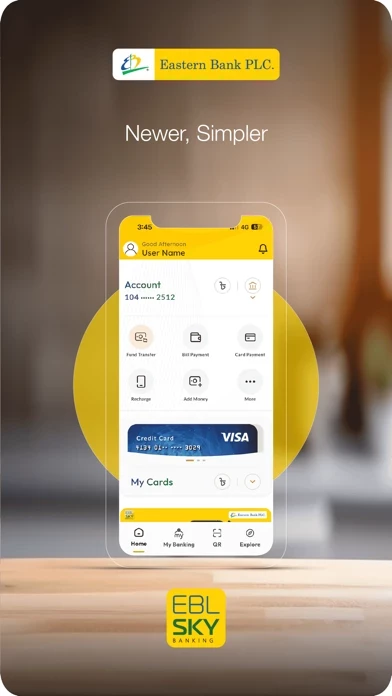
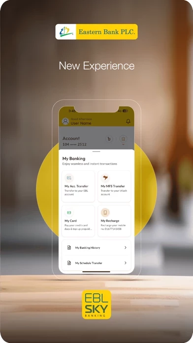
The only positive thing in EBLSKYBANKING is the icons or UI. It would have been better if I could see the features, recent history, cards etc., instead of offers.