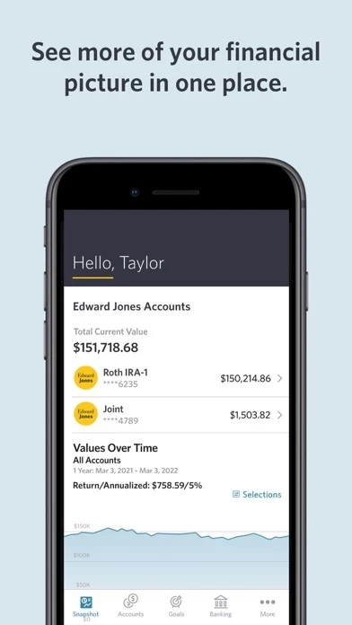
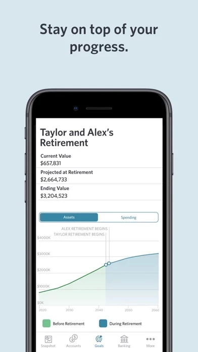
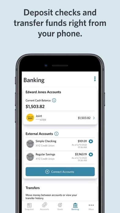
This has to be the worst app change in the history of app changes. You have made your app worse by leaps and bounds and are pretending your users like it. It makes Edward Jones look bad generally. Not sure who your target audience was, but it wasn’t me or the many other users I’ve talked to. Your clearly unconcerned about your clients feelings on how they view and manage the assets they hold with you. I even accidentally sent a note to your legal department and their reply was embarrassing (don’t let legal respond to your customers, generally a bad idea). We have all given EdwardJones enough time, it’s as bad as it was when it was first released. One example of many, why can I now only see one aspect of my stock holding, why would you make it so I have to use some silly swipe at the top to change from one metric to another? Really?!?! Please, make some dramatic changes, use different design people, talk to clients, something, but make a change!


