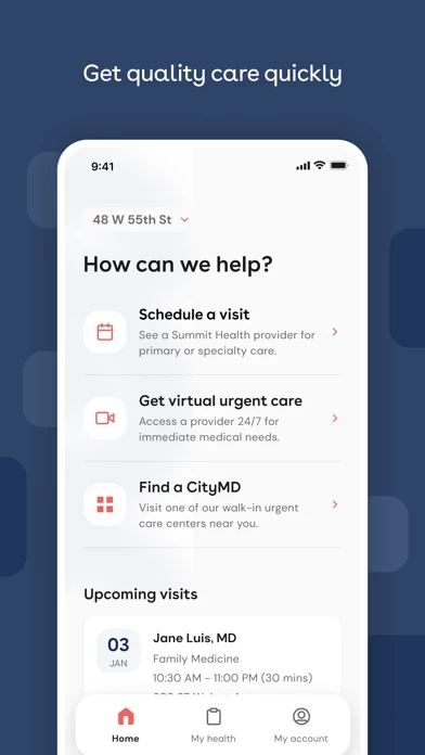
When seeking to show your test results to a partner, it may be hard for anybody to take it seriously because SummitCityMD literally looks extremely childish with the FONT that they use. Does not look like it is from a legitimate medical provider/site.
Would be 100% efficient and smart if when reviewing your results, it had your full name, DOB, and date of results on the top.. without that crucial information anybody can just take a screenshot of previous negative results or someone else’s results if their intent is to be malicious and hide current results. Also would be better if SummitCityMD also displayed the date that the sample was collected/testing was done (like a normal portal does), not just the “date received” for the results. CityMDs original portal had the doctors name, location test was taken, date and time collected, date and time sent to lab, and date and time results were submitted. And also smart if SummitCityMD allowed you to zoom in AND out - so that if the user wants to screenshot their results they can zoom out and condense all needed info in one image. Also I don’t need that generic “Note on your results” info at that time. That can be added to the bottom so that the title/name of the test conducted and the results are near each other. These are all basic and obvious medical needs and simplicity, and I hope the apps makes these changes.

