🏷️ About:
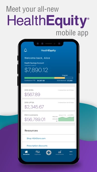
The HealthEquity mobile app is a convenient and powerful tool that gives you on-the-go access to your benefit accounts.
Features include:
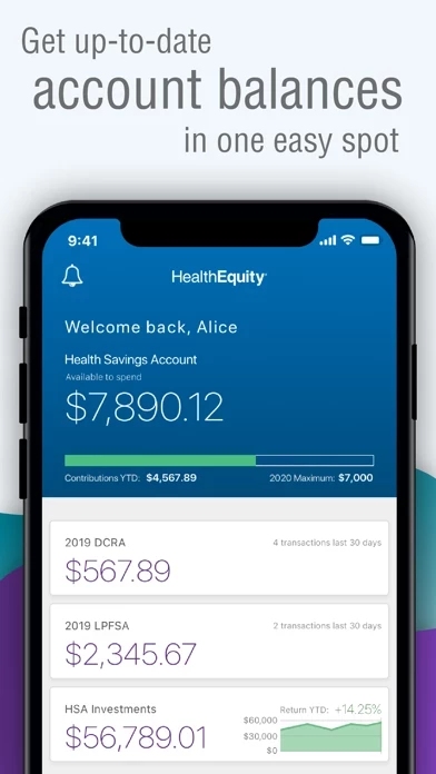
· On-the-go access and history: Access all account types wherever you go.
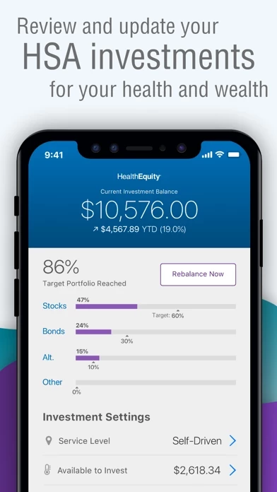
- Balances, investments and uploads are greatly improved.
- Login works great.
- Face scanner is now functioning.
Read 35 Customer Service Reviews 👿🤬😡😠💢😤
4.1 out of 5
Where can I go downgrade?
2022-05-30
by Emarlin
Sure HealthEquity is prettier, but that is far less important than functionality. This version continues to list unpaid but pending bills as “new unpaid” until i close HealthEquity and log in again to fetch data. The payment page also auto-scrolls back up when I click the accept terms check box, then I must scroll down again to remit payment. Finally, maybe you see it as a safety feature, but forcing me to type in the payment amount is just asking for a typo. Give me the option to select full amount like my credit card company payment screens do. Fix this now or start paying customers to be your UX testing team. Horrible customer experience!!!
Just not good
2022-07-01
by Sefo[w]
I do not understand how HealthEquity is rated so highly. Simple things like capturing receipts and submitting claims just don’t work. Simple workflows are convoluted and buttons look like simple labels. Whomever designs HealthEquity either hates their customers or just doesn’t understand good UX design.
All of this is applicable if you can even get HealthEquity to work. Submitting expenses causes freezes. Eventually it starts to ask you if you want to remain active and even if you say yes it keeps popping up asking. Eventually it logs you out and you lose everything. I haven’t been able to submit one reimbursement via HealthEquity .
Please spend sometime testing this thing before you push it out for people to use. Folks funds are locked behind this garbage. Do better.
Way too complicated
2022-08-01
by Chops847
The new app looks nice but regular expense tasks are buried. New expenses don’t show up in HealthEquity on the same day as the expense happens, so you cannot attach the receipt immediately. If you simply save the receipt in HealthEquity to attach it later there is no way to review it large enough to see the numbers outside of a useless thumbnail.
The previous service my employer used had it right. As soon as an expense happened it appeared in HealthEquity moments later. I could simply take a picture of the receipt right from the main page of HealthEquity and file the physical paperwork when I got home. Easy, painless and straightforward. I had to hunt to do this on the latest version of HealthEquity .
Do they have a QA group?
2022-09-02
by StephenTX214
I am an actual user (not a competitor as another review claims), and this is by far the most incompetently designed and executed app I have ever seen. I submit a claim or two every month, and every time I try to use HealthEquity first in hopes they’ve finally fixed it. Yet every month, it’s broken in completely new and “interesting” ways that force me back to the web site yet again.
It is obvious nobody at this app has ever actually used their app and there is no QA being done; they just dump it on the users (trapped by their employer’s choice, which makes the competitor comment bizarre) and let them report what doesn’t work. And for every bug they do eventually fix, they break three more things.
Use the web site instead, and from a desktop since it doesn’t work on a tablet/phone any better than HealthEquity does. Its workflow is almost as nonsensical, but at least you can actually get things done after a banging your head against the wall enough times.
Hello, just wanted to drop a note about my experience over the past few months with HealthEquity. I used to absolutely love this because I can quickly access all my remaining bills after insurance and pay my doctors from my HRA, HSA etc. but as of late, HealthEquity has not been working. I called in for assistance and was told that there is nobody there that actually manages HealthEquity and make sure it is updated and working. I find this very odd and concerning. It took until now for my funds for this fiscal year to finally post but I still am not able to actually use those funds from HealthEquity to make payments like I have been able to do for the past two years. This is very frustrating! The same guy that told me no one monitors HealthEquity suggested I pay at the time of service! No thank you! I want to see the items and what I owe before I pay, it prevents outstanding balances and overpayments. He then said I could pay online with a computer instead of using HealthEquity but the funds will still not process, I get an error message every time I submit with a number to call (that I called) with no resolve. Basically be advised, you may not be able to actually use your money. 😔
Incredibly frustrating
2022-11-04
by Cnp8119
I cannot express enough hope much I dread HealthEquity. Receipts must be attached to every transaction (which is ridiculous when the card emails me every time my insurance is used, whether the card was used or not... you would think they could just match things up), but that’s fine. Except that every time I tap “attach document” HealthEquity closes itself out and I have to log back in and try again. I have about six transactions I need to attach receipts to today, and I’ve logged in 7 times and only been able to attach one. I guess since they have all the power in the relationship—because if we don’t attach the receipts, they’ll just shut out cards down, and since our company chooses the FSA host so we cannot just change to a better one—they don’t feel any incentive to improve this for us. Seriously frustrating.
Garbage app
2022-12-06
by ~CC~ In WI
HealthEquity is terrible. How does a person upload documents almost a year ago that payments get processed and now you say those documents are no longer sufficient? Now I need to include an itemized bill for approval or you need to pay us back? Why am I the only person on the account for services when I have dependents under the dental portion of my insurance? Why are the documents I uploaded all of the sudden blurry? Why can’t I attach documents to past payments- it says filter and nothing shows up? If this is the company that you employer uses, do your self a HUGE favor and stay in control of your own money by putting it away in your own bank or another company you can choose and investigate. After all it is YOUR money and it shouldn’t be this hard to JUSTIFY your payments on medical expenses!! Just garbage!
QA A/B testing...I think not
2023-01-06
by MBRO95
StephanTX214 said it best, I couldn’t phrase it better myself considering his review and his comments on another 5-star review (HOW IN THE WORLD, btw).
The old app was an absolute crapshoot but it kinda worked and was MUCH more streamlined than this new version. The providers storage/logging/database (idk what to call it cause it never worked) has never and still does not store information on previous providers that would make it much easier to submit claims. Most folks see the same care providers...I, for one, LOVE entering the same information over and over again for each claim.
I can’t even begin to describe how much of a step backwards the new app is...
1) Cluttered UI 2) Terrible user journey to submit a claim 3) Terrible user experience 4) What’s a pop-out? (Sarcasm) This is the most outdated component I’ve seen. 5) Throw all the information you can at me, in tiny font. Yes, it’s productive for me to look at. I get lost in the sauce of my HSA every time I open HealthEquity. It oozes with creativity, and practicality. The streamlined nature of it is truly remarkable.
Do you guys do ANY SAT/QA/A-B testing? Surely, NO ONE would’ve chosen this new layout over the old. Jeez o man this is a shameful development shop.
Worst app ever!
2023-02-07
by ThisNicknameIsTakenMeh
Not only does this FSA provider have a weird way of submitting claims, not user friendly at all (compared to other FSAs), also HealthEquity is extremely awful! It is very slow loading, crashes, tells me my account doesn’t exist even though I can login on the site, constantly has error popups, and when docs are loaded it doesn’t show up just looks blank. It’s so absurd to have these types of issues in 2022 with a simple app. To make things worse, none of my claims from my insurance are syncing up to the FSA and neither the insurance company or Health Equity will take ownership and resolve it. So now I h e to use HealthEquity more than ever to MANUALLY input claims that historically have always automatically popped up in the FSA app. Worst FSA experience ever. I hope we switch providers soon.
I am told I need documentation for my expenses, but finding the place to upload and attach them is all but impossible on both the site and HealthEquity . When I finally find it, it doesn't work. Sometimes I find expenses that require documentation but I was never notified about it, and on one list it says approved, no problem, but on another page is says it needs documents. I cannot figure out how to use this account. I'm just going to pay for my medical expenses and if they have a problem with it, come find me and I'll give them my documents and they can upload them to their own d*** files. I sure as h*** can't figure it out.
Buggy, but okay
2023-04-09
by A Dankster
I’ve been using HealthEquity to reimburse childcare expenses. For the most part, it works okay, and it eventually gets the job done. But there are some frustrating flaws that really should be addressed.
Every receipt I claim for reimbursement requires filling out the necessary information, such as dates, costs, provider, etc. Understandable, no problem, I get it. However, when I go to select “provider,” it’s supposed to populate the information I’ve previously entered—in my case, my kid’s childcare center. That rarely works, so I have to manually enter in all that same information again and again.
I’ve also had a recurring experience where I’ll snap a picture of the receipt, add it to an expense, and save it for later. Then when I attempt to get reimbursed for those expenses, the documentation just isn’t there. So I have to fill out all the information again. This has happened at least a dozen times now.
In addition to those larger qualms, HealthEquity itself crashes somewhat regularly and takes forever to load.
Needs an overhaul
2023-05-11
by YouKnowItIKnowIt
Unfortunately my company uses woke-named “this app”. HealthEquity works in a sense, but leaves way too much to be desired. It’s slow, frequently crashes, difficult to navigate, barely performs the essential functions. Want to submit a claim? Well, HealthEquity will replace the provider’s name with your own after submission, corrupting up your claim history. Can you correct it in app or online? Absolutely not. Need to attach a receipt? Better take a photo first because HealthEquity forces a square aspect ratio. Once your receipt is attached, time to submit for reimbursement. Wait, HealthEquity froze on submission and won’t respond despite waiting? Time to force kill. Want to look at claim history? You have to dig through the menus to find it. While you’re digging through those menus, you’re waiting for HealthEquity to respond to your screen taps. Now HealthEquity is unresponsive. Time to force kill and start over. Oh, HealthEquity submitted the claim twice? Well, time to login online and navigate who different screens, using different lexicon for the same concepts, in order to void the claim.
I’m not sure how any of these basic features were released in this state. Did you even perform functional analysis? Did you perform heuristic analysis of usability?
As a reference, the PayFlex app is very basic, but responsive and functional. Take a look at the competition and learn what makes them successful.
Confusing to Manage
2023-06-11
by Dolphin2450
Functionally, I love using health equity for the investment side of my HSA. For what it’s actually supposed to be used for, (health payments) I find it to be extremely confusing and buggy.
It’s not clear how expenses, documentation, claims, payments, and reimbursement actually work together. I’m scared that I won’t have documented a payment/reimbursement correctly and that I’ll face issues with the IRS down the road because of this.
The receipt capture part of HealthEquity is also not very helpful. When taking pictures of receipts, it ends up trying to crop them in a “square” format that cuts out a significant part of the original image. When have you ever seen a square receipt??? I certainly haven’t ever seen one.
UX fail
2023-07-13
by ZardozCodes
New UI is terribly unusable. The old one was significantly easier to use. No point making it look pretty if it’s harder to get tasks done. Why wouldn’t you default the service end date to the service start date when the start date is changed? Why force entry for a provider billing address if I’m going to reimburse myself? Maybe ask first in the flow. Why force a dollar entry on the final reimbursement screen when it’s already there twice. At least default it. Why does the receipt attach camera capture want to force crop to a square? Have you ever received a perfectly square receipt? I haven’t. Why is the receipt image shown rotated 90 degrees from the capture angle? Why not allow multiple selects from the expenses list when requesting reimbursement? Or at least refresh the list reimbursement status when returning to it from the reimbursement flow. I could go on.
This is the SLOWEST and BUGGIEST app I have. It is painful for me to use. I usually have to try 3-4 times to get a reimbursement request submitted because it will freeze or crash that often during use. I’ve had it for years and it has only had mild improvements during that time. If it wasn’t chosen for me by my employer, I would delete it in a heartbeat. The pop up menu takes 10+ seconds to load each time, if it even does. The list of Providers only loads half the time. It crashes after submission the other half. There’s little to no information about the status of a claim or when it will actually be reimbursed. It has a generally good concept behind it, but the execution is terrible. Submitting a claim should take me only about a minute, but it usually takes at least 10 with all the bugs. Each selection will often freeze, have no options to choose from, or cause HealthEquity to crash completely.
Needs improvement
2023-09-14
by Justeeny1118
I tried 3times over almost a 2 week period to submit a reimbursement… HealthEquity kept a crashing everytime I hit submit. Ended up having to use the website. Ui/ux Comments to help: if I submitted for an expense of $30 then click reimburse me why do i have to type $30, why doesn’t it default to expense amount like website? The buttons that require confirmation in HealthEquity (terms and conditions on reimburse submit page and the checking account option) - the check mark indicator that the button has when it has been clicked is not noticeable on the right. And it’s not clear to user that a button of that design would need to be clicked. Recommend a check box.
Still has bugs
2023-10-16
by Ckuk1
Two major bugs. When trying to get reimbursed for an expense I have to add a new vendor almost every time even though I’ve input the same vendor repeatedly. On a rare occasion when I search for it, low and behold it’s there but not the next time. Other issue is one expense at the end of the year keeps having an error that says they are trying to fix, been that way for 2 months, still not fixed. Have tried deleting and starting new and still same issue.
App update is nice
2023-11-16
by Bobrown101
I personally use HealthEquity for my HSA. I feel like most people in this position are probably using HealthEquity to check their balance, or request a reimbursement, so I would focus development effort on improving the user experience around those key features.
Before HealthEquity update faceid didn’t work which was extremely frustrating. That was easily my biggest request and now it is functioning
Better but not perfect yet
2023-12-18
by DNCRGRLJO
I believe when you leave a review, it offers suggestions of how to improve. When I see reviews of “it’s the worst app in the world” it’s unhelpful and probably a competitor trying to lower scores or someone that doesn’t actually want you to fix anything. This new app is a big improvement from the old one. I’d like to see easier filtering for “expenses”. but balances, investments and uploads are greatly improved. Login works great and thanks for fixing the face scanner. I look forward to further improvements.
I like the new look of HealthEquity . I don’t ever look at reviews that say “worst app ever” or something to that effect. If you’re going to leave a review be constructive and provide actual feedback. The developers can’t do anything with “worst app ever”.
The look and feel are nice. I like the popover from the plus button a nice look. I like seeing my total contributions on the main screen. I will take thing here that is frustrating to me. When I get emails from you about my employers contribution or my employee contribution you should have the amounts that were added. I know that has nothing to do with HealthEquity , but it’s a frustrating thing for me. I like how much easier and clearer it is to add expenses and look at expenses. Over all nice job.
Broken app
2024-11-21
by James51519
I tried to use HealthEquity to manage my account and to submit reimbursement requests. I found panels overlapping many times making navigating and viewing info nearly impossible. The header would overlap into the top bar where the time and icons reside, which would render the menu button inaccessible, forcing me to restart HealthEquity multiple times to reset the glitches so I could get done what I needed to do. App has good potential but has critical alignment issues.
Terrible
2024-11-21
by ProfMom12
I used another FSA app at my previous job, and the change to HealthEquity has been just awful. Don’t bother to set up TouchID. It will make you redo it about once a week. Also, you can submit claims on HealthEquity , but you can’t request reimbursement to your bank account without logging in through a web browser. There are some other weird quirks like if you want to submit a claim for reimbursement from a dependent care account, it still asks you about the “patient.” Finally, claims take FOREVER to process from this company. If you request a fund transfer to your bank account, don’t count on accessing your funds for AT LEAST a week.
Awful
2024-11-21
by Sharon101899
I’ve used HealthEquity for a few years now. It gets worse and worse by the day instead of better. There’s constantly glitches with it. I haven’t been able to get reimbursed for a claim for days now because it just keeps timing out. It also currently won’t let me match up a payment made with my card to the respective claim. Making a one time contribution requires logging on via a browser. If you use HealthEquity it will be a recurring contribution. All in all HealthEquity is the worst. Apps are suppose to make lives easier not more difficult.
Lacks Basic Functionality
2024-11-21
by Biggd963
My previous HSA provider app was much better. It used to show Pending transactions when using the debit car this made a lot of sense because I could take a picture of a receipt and then attach it right away and not have to remember to come back and attach it 3 days later when the transaction has posted. Same with deposits...if payday is Friday show the pending deposit...how is this basic functionality missing in 2019?
I’ve notified their customer service (no reply of course) that HealthEquity does not show investment balances and frequently shows “$0.00” instead of the actual balance. Makes me question if the other numbers are correct.
Poor performance
2024-11-21
by Stoones
App is extremely slow to load and functionality is worthless. Save yourself the effort and headache and visit the website instead.
Losing functionality
2024-11-21
by Iamshoo
HealthEquity has not been updated for quite some time. There is some functionality that has stopped working. I can no longer match claims to card payments. Previously I could complete this via HealthEquity . Now I need to complete this via a browser. I tried to report the problem sending in detailed instructions and was told I need to call a help desk number.
Makes my life so much easier
2024-11-21
by RickKrause
Good app, setup was easy, functioned just the way i expected it too. Really psyched to have this, makes my life so much easier.
The only thing I wish it had was the ability to filter by dependent. This is available on the web version and is very helpful when trying to track down claims.
Needs bug fixes
2024-11-21
by Doggymama76
A couple times I have used HealthEquity and the screen splits like it was about to slide over to open another page but freezes and i can’t get to the home page.
I love being able to check all of my balances, review transactions, and submit for reimbursements on the go! I’m also terrible at keeping receipts, so being able to take pictures and upload them right to my account is sooo useful.
Fastest way to move money
2024-11-21
by Webejammin673
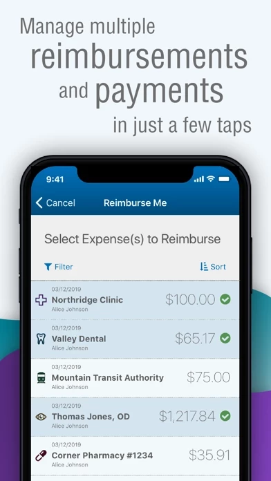
Seems this is the easiest way to get reimbursed. I just snapped a picture of my dental receipt I paid with my credit card, and submitted for reimbursement. I was able to select a few other claims while I was in there and did them all at once.
Solid App
2024-11-21
by Jim-Nini
HealthEquity makes it easy to manage my account especially when it comes to reimbursements. Snapping a picture of a receipt and matching it to an expense has saved me a ton of time instead of using the website.
Push notifications!
2024-11-21
by Angieand3
I love how I get notifications as soon as my card is ran. I can take a picture of documentation and upload it right to my profile and I can use that documentation to request reimbursement or link it to an existing claim on file. The improvement I think it needs is to integrate advisor into the mobile app and to get an alert if your balance starts to go below a limit set by the person
Easy to use
2024-11-21
by Hiy34
I like being able to view my claims and upload receipts when I’m away from my computer.
App functions great, easy to use and navigate. I can do everything I need from my phone. My favorite thing is that I can upload my receipts as soon as I have them...even when I’m sitting in the waiting room at the doctors office. I can do it right then and don’t have to worry about it later. It’s super fast.
Is HealthEquity Safe? 🤗🙏
Yes. HealthEquity Mobile is quiet safe to use but use with caution. This is based on our NLP (Natural language processing) analysis of over 4,151 User Reviews sourced from the Appstore and the appstore cumulative rating of 4.1/5 . Justuseapp Safety Score for HealthEquity Is 31.6/100.
Is HealthEquity Legit? 💯
Yes. HealthEquity Mobile is legit, but not 100% legit to us. This conclusion was arrived at by running over 4,151 HealthEquity Mobile User Reviews through our NLP machine learning process to determine if users believe the app is legitimate or not. Based on this, Justuseapp Legitimacy Score for HealthEquity Is 47.4/100..
HealthEquity Mobile works most of the time. If it is not working for you, we recommend you excersise some patience and retry later or Contact Support.
How was your experience with HealthEquity Mobile? Post a Review
Features
· Ability to manage debit card transactions: Link your debit card transactions to claims and documentation.
· Documentation: Take a photo with your device, upload images from your gallery, or add images and PDFs from the Files app to initiate claims and payments.
· Claims initiation and status viewing: View the status of claims as well as link payments and documentation to claims.
· Ability to send payments & reimbursements: Send payments to providers or reimburse yourself for out-of-pocket expenses directly from your account.
The HealthEquity mobile app is a convenient and powerful tool that gives you on-the-go access to your benefit accounts.
· Investments: Manage your HSA and MSA investments including buying and selling funds, researching performance, and making trades.
· On-the-go access and history: Access all account types wherever you go.
· Notifications: Receive alerts when your HealthEquity card is used.