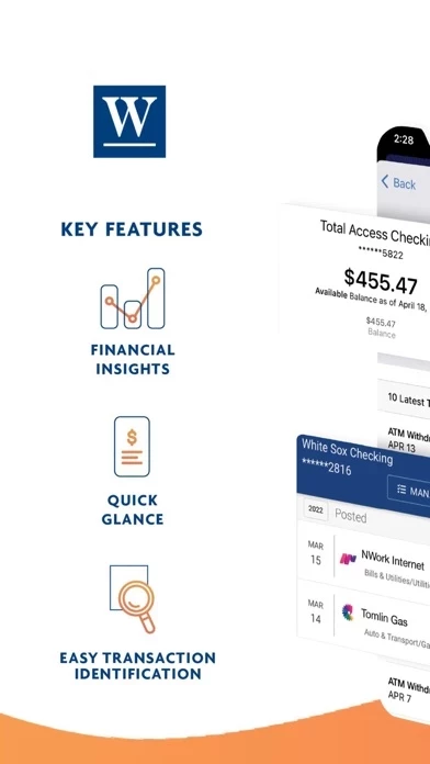
I agree with other reviewers that the old app was ready for an update, but this update, while boasting ostensibly flashy visuals, strikes me as a step backwards. I’m accessing my account using an iPhone/iOS, and each transaction appears on my screen not in list form, but instead with text that is set *vertically* rather than horizontally. This is insanely cumbersome! As a result, I have to scroll way, way down to get through each single transaction in my checking account to understand what it is. This just seems utterly amateurish! I am hoping this can be fixed quickly. Otherwise WintrustCommunityBanks is useless — and without a functional app, I’m afraid I am forced to look for a new bank. It’s as simple as that. I love the idea of supporting a community bank, but to do so, the bank has to be minimally competent. Alas, WintrustCommunityBanks does not meet that standard.