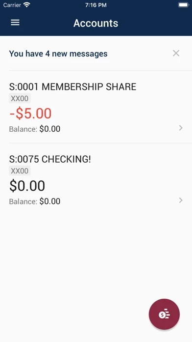
New and improved app?! This is only true if they’re competing to be the worst app on MSGCU Store. It is hard to be worse than The Weather Channel app, but it’s close. They added a few features such as P2P transfer, which is undoubtedly a nice feature. Otherwise, they basically changed the font size so you can now read your account balance from across the room. Of course, you need to be able to load MSGCU to actually be able to see your balance in size 47 font. Loading MSGCU usually involves opening and closing it 8-10 times before you can finally get in. Once you’re finally in, the interface is similar to how it was before, with larger font and advertisements.
This is a banking app, not a high school level coding project. Please rebuild your app that reflects the good bank that you are.
Again, MSGCU is straight trash!