Almost every part of the UI was counter-intuitive, annoying, or buggy. If this is a hobby-made app, good job on the effort of making SnapHabit (it’s extensive and fully built out), but if you want SnapHabit to be something useable, invest some time into learning user experience best practices.
A list of things off the top of my head that I didn’t like within the first few minutes:
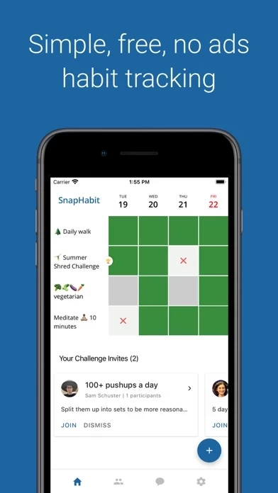
- Couldn’t find the add new task button easily
- Add new task button disappears when you scroll down on first page
- Having the journeys take up most of the first page is annoying
- incessant prompts to invite others or to link to social media
- starts out with preset habits
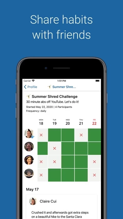
- it’s too hard to delete habits
- seriously, it’s like every button tap results in a prompt to invite people, each time that prompt comes up I want to invite people less and delete SnapHabit more
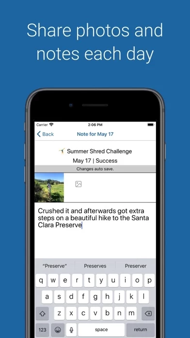
- prompting user to take a note EVERY time they skipped a day is really annoying
- buttons on the top right of the habit details page flip back-and-forth sporadically
The list goes on. Even just one of these would make me want to delete SnapHabit , but there are soo many issues.
It’s probably apparent that I’m annoyed, but hopefully this is useful to the devs.