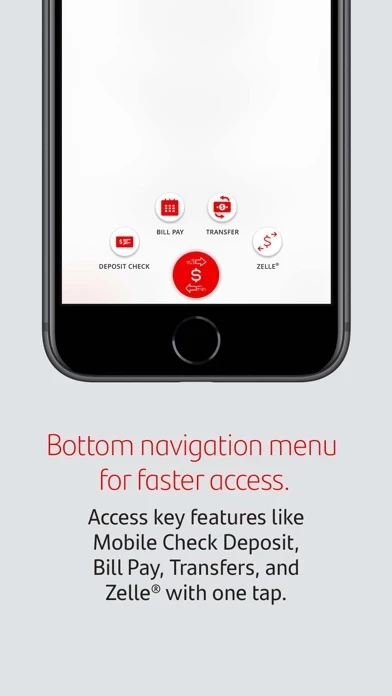
I’ve been with Santander for about a decade now, during most of which time, I’ve used their online services. Their iPhone app has been absolutely wonderful, aside from not connecting my Apple Watch that well, but small details can been overlooked. This latest update, however, changed the entire UI of the application, and it’s not great. SantanderBankUS has slowed down, is less intuitive, and just doesn’t seem to function anywhere as fluidly as it used to. It feels like it went from “personal” with its colorful UI to very “business,” feeling all grey and bland. I wish I had better things to say, but it honestly feels like a few steps back in functionality, speed, and general likeability


