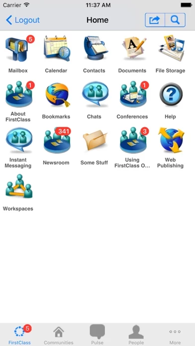
I can't think of a more aesthetically displeasing application that I have bought. The only reason I purchased FirstClass was to access my school's this app server. Admittedly, I didn't expect much, but I can't stand how it looks and feels. FirstClass needs A LOT of work. The developers worked hard to emulate the iPhone's home screen, but it comes out ugly and a lot of the design choices give me a headache everytime I have to open FirstClass .
I'd love to see a complete redesign of FirstClass because there are a lot of usability issues with the way FirstClass behaves. Also the icons have so little meaning, I have to tap them and see what they do to figure it out. FirstClass uses different icons than you'd expect for things like searching.
Anyways, the most important thing I think the developers of the iPhone (and desktop clients needs) to do is to overhaul the interface to match the simplicity of the concept. However, I'm not optimistic because in the about 4 years my school has been using this app, there has been little to no progress on this front.
I know some people will think that I'm being overdramatic with the aesthetics, but to me the way you interact with the service is just as important as the service itself (which is pretty much how the iPhone is designed). If I have to look at FirstClass several times a day, I'd better like what I'm looking at.