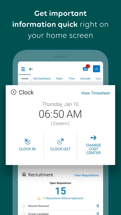
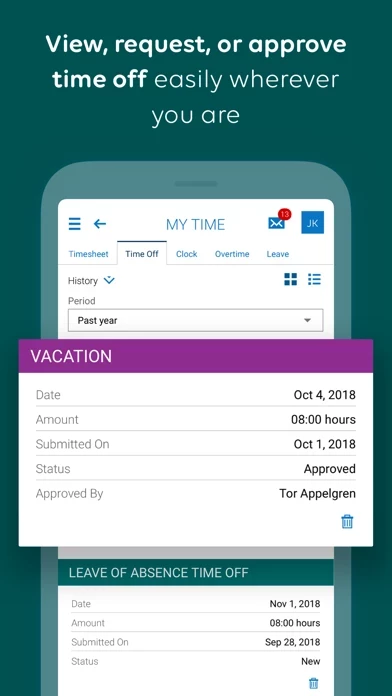
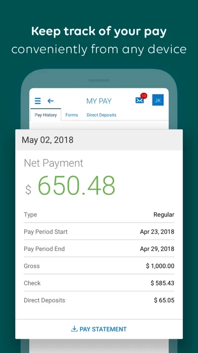
It feels like UKGReady was designed by an HR department. While it has plenty of functionality (even an ical/Google RSS link to auto add your work schedule👍🏻), it is quite difficult to navigate and difficult to review.
To the devs, I would strongly recommend hiring a design/UX firm. Regularly used functions are hidden, looks/acts like a spreadsheet, notifications need work, small buttons, etc.
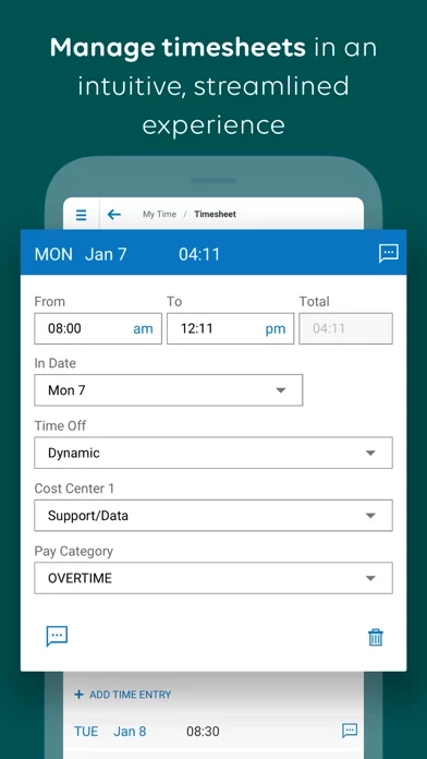
E.g. my company asks everyone to review and correct their timesheets for missed clock-ins/outs. You have to manually expand and review each day, compare to original schedule, figure out what is missing, then dig for the option to send a change request.
Since the schedule is already IN UKGReady , there should be a simple algorithm that highlights days that are outside those hours for review/approval. And if there’s an odd number of punches on any day… likely a missed punch. Day should turn red, notification, whatever.
Again, seems to have features but they are NOT user friendly. Needs improvement


