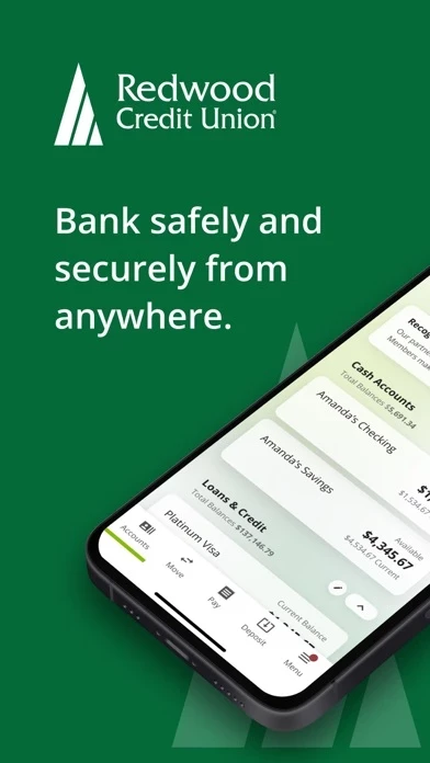
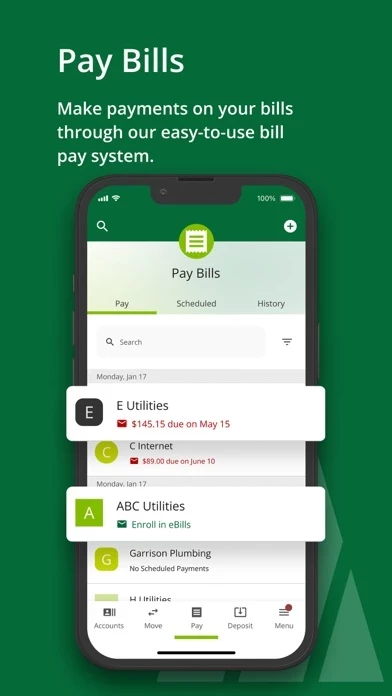
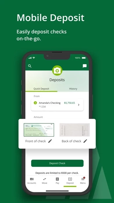
Very strange UX that was built almost from zero, it doesn’t resemble anything else, it’s hard to navigate. UI is tired, it feels 2014. Learn from your competitors’ app experience, say Wise or Tinkoff, and RCU app will skyrocket in positive feedback. So far it’s always a struggle to use. My number one complaint is not showing the amount and merchant when getting a notification about the transaction. It says, “A transaction occurred, if not you, call this number.” This is so obsolete, it doesn’t bring almost any value to me as a customer. All four banks that I’ve been using had shown the sum and merchant in such notification (which, incidentally, your UX names as “alerts” [??]). Now it makes me wondering if it’s a deliverable decision, my non-profit friends. . . I like the account balance widget though, it’s nicely made according to Apple’s guidelines, well done. If only the whole app was like that.


