The fundamental job of a task/project management application is to be as easy to use as a post-it note, but provide more organization and tracking tools than a post-it note, without getting in the way.
Fundamentally, when working, adding or removing a task must be as easy or easier than writing it down on a checklist, or checking a box; because you aren't just competing with MS Project, Trello, and the like: you're competing with *free* lists, spreadsheets, and post-it notes.
After this app was recommended to me I've spent over a week trying to understand what it is, how it works, watching videos, etc. And yet every time I open it to add a task, check it off, or see what's next, I find myself starting at perplexing menus with no intuitive way to do what I want, and no discoverable hints at how one would.
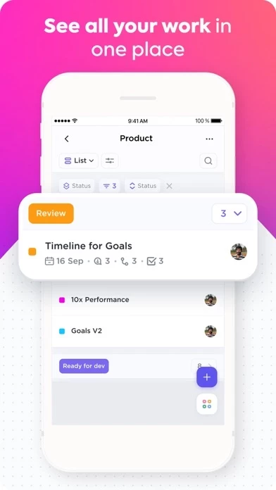
One particularly awful example is Spaces. You cannot add a task without it being in a Space (which is bad). You cannot add a Space from a draft task, so if you wrote it out, but don't have a space for it, too bad. You have to write it out again after creating the space. What's worse, you can't add a Space from the *Spaces* context! You have to go to the *Discover* context for that, which has an icon that looks more like "Safari".
Who would think "I want to add a basic task. I should click Safari, add a Space, then add the task to that Space from a different menu"?
Nobody would, and I think that's who ClickUp is for. :(