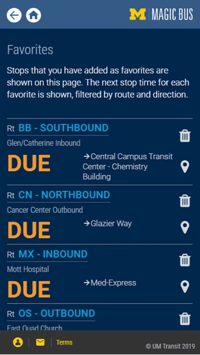
Every aspect of anything resembling a normal iOS app has been reconstructed from scratch in the most unappealing and unusable way possible in UMMagicBus. While it seems like a lot of work was put in, it was the wrong type of work that ended in a convoluted app with complex actions using tools and design patterns either from 2010 or invented on the spot. Ugly colors and fonts aside, it is riddled with bugs, an unusable UI, terrible actions, and unclear instructions. Some issues include the following:
- you cannot zoom in then zoom out in the map in one gesture
- busses do not update
- scrolling is shaky and seems like it was built from scratch
- header and navigation are not functional, you cannot go back to a previous page. nothing is standardized or taking advantage of normal app development patterns
- there is a common design pattern of embedding another webpage into another
- inputting text is nearly impossible and you need to scroll to see the entire form
- unclear actions like prioritizing a bus stop number (what even is that???)
- clicking on one page will reset the map’s zoom
- i have no idea how to close models
The University can do much better. Please ditch UMMagicBus.