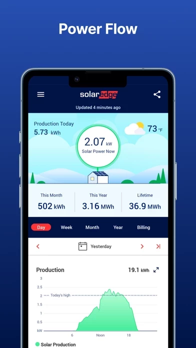
I use an iPad and a desktop computer to monitor system performance. The displays in mySolarEdge, with their huge amounts of wasted empty space, seem designed for an Apple Watch. There are multiple pages to switch between, and scroll to, and all of the information available on those pages could have been adequately displayed on, at most, a couple of pages.
The home display, for example, which probably resulted in high fives among the designers and developers when they were congratulating each other on how *pretty* it was, uses several million pixels, including a high-resolution picture of a bunch of framed solar panels, to convey five pieces of non-static information, which could easily fit on *one* line of text. The important information — current power, and daily energy — comprises maybe a dozen characters, which are swimming in a sea of useless white space.
Updating is flaky. There’s system information that is cryptic and unexplained. Navigation is somewhat confusing, with some pages that look too much like each other.
Somebody in charge should read Edward R. Tufte’s “The Visual Display of Quantitative Information”, and then find a couple of electrical engineers to help design mySolarEdge ’s displays. Stay away from people whose resumes start with credentials about “Web design” and “User experience.”