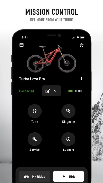
The good part is, Specialized provides a lot of really useful and customizable data, that is accessible while you ride, if you have a display unit of some type. I have a Turbo Levo, using an old iPhone as a display unit. Additionally, you can tune the power characteristics of the bike, which is great. However, I have two real issues with Specialized.
The first deals with opening Specialized . You are required to log onto Specialized via the Internet. I often ride in remote areas where I have no cell or Wi-Fi access. Should I forget to log onto Specialized before I leave home, I’m just out of luck. I can’t even connect to the bike. Specialized becomes useless! And, no, I don’t want to be logged onto Specialized all the time, thank you.
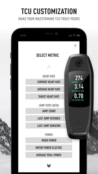
The second issue I have deals with the fonts that are used. Red lettering, especially in a micro sized font on a black background, may look nice, but can be almost impossible to read without reading glasses, for some. I see no reason why larger fonts can’t be used. This makes no sense. It would also be better to have white lettering on a black background. One shouldn’t have to dig out reading glasses, on the trail, just to decipher the micro font notices . For me, the font size and color issue is the single most frustrating feature of Specialized, and would seem to be easily correctable.