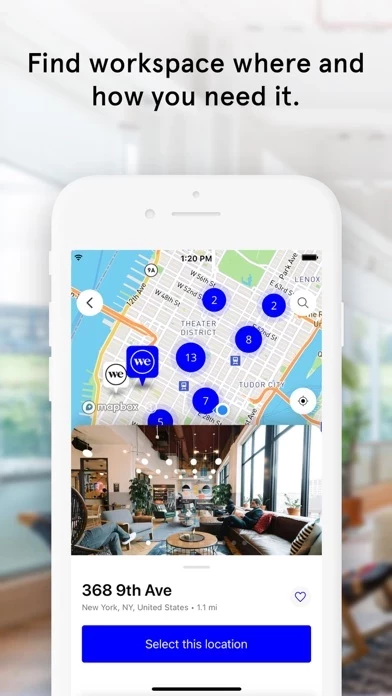
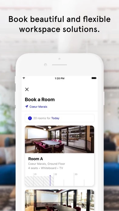
Stark white design with teeny light grey type - who thought this was a good idea? On my iPhone XS Max with a huge screen, the type is still very small. Even in places with icons and a lot of space (like the vertical scroll in Space to select desk, room, guest) the icon and type and so deliberately small and grey within the larger box. In the messages area where the incoming notes look like SMS messages, still far smaller than actual iPhone txt messages with standard sizing. WeWork also doesn’t have a settings feature to control contrast or size. (I know I could change a global setting on my phone but why do that just to fix one poorly designed app app with readability issues?) In an attempt to make it cool and hip, you’ve made it less friendly. Kinda just like this app space with super trendy furniture that’s uncomfortably close to the ground and not conducive to work. If consistency is the goal, you win! If usability is the goal, this counts as a large leap in the wrong direction.


