The new app is dramatically different, and on the whole, I’m not happy with it.
What’s good:
-Search capability
-Snappy performance
What’s bad
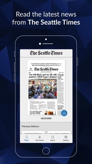
- Print format only available by paging through pages two at a time - there is no way to rapidly navigate back and forth to different sections (like the upper tab interface on the old app)
-If you select an article, it then displays in non-print edition format
-Many times the graphics or photos associated with an article do not display when you select that article (imagine a front page story continued on page 11, with a graphic on page 11. You get to page through to page 11 and see the graphic, or to select the article, and read it in non-print-edition format, often without the graphic). Neither choice is good.
-No way to navigate through the paper without going one page at a time
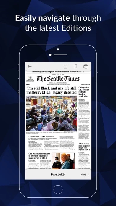
-When an article starts on one page, and finishes on another, you have to manually flip through many pages
-SeattleTimesPrintReplica is optimized for portrait mode – I use my iPad (and prefer) landscape mode
-You can’t readily flip pages until you zoom out to 100% (but you have to zoom in to read the print of any article). So, flipping pages is a multi-step process (zoom out, flip, zoom in). UGH.
-The search feature is available at the top level, but not when you’re in today’s paper or in an article. ARGH.