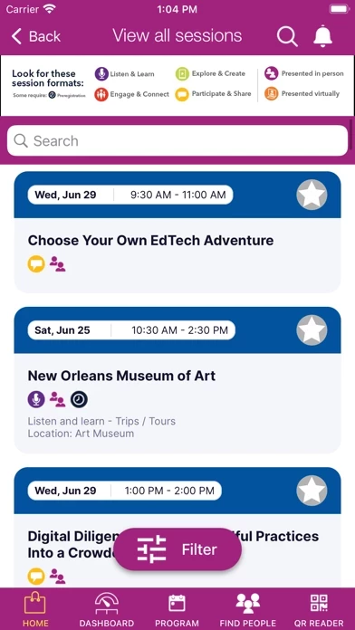
Just in the first few minutes, issues from years past are still very painfully evident, including (1) forced portrait mode on an IPad; (2) no way to see more than 100 characters of a session description (really??); (3) illegible-sized fonts that ignore system settings; and probably worst, (4) when you swipe to another app, you totally lose your place and filters for what you were looking at, and you start entirely over. Even if you swipe out for a few seconds, you waste 10-20 seconds getting back to your schedule … which starts you on Sunday even though it may be Tuesday.
Forget trying to build a schedule on the IPad or IPhone app, impossible as you’re not shown any of the description beyond 100 characters. Do your planning from a desktop, or from your mobile browser, then import it into ISTELive24 . I guess that’s the way to do it.
Does anyone at ISTE care, or does anyone there use their own app? My school district is bringing fewer people to the conference this year, due to rising prices and diminishing value. Seeing how poor ISTELive24 experience is, and how poor it’s been for years now, does not reflect good on the organization.