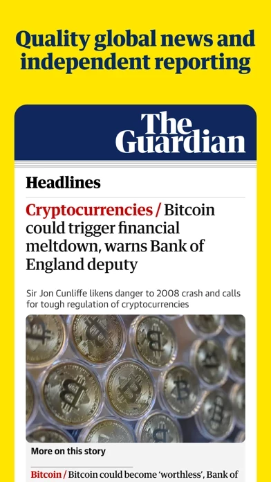
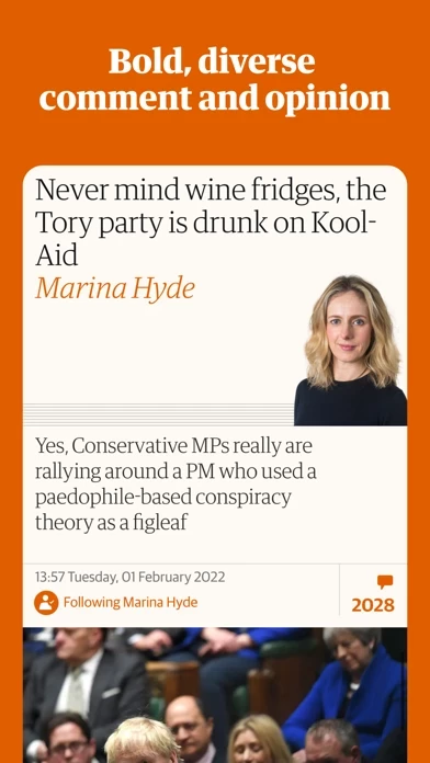
Latest version took another step backwards! What's with the tiny headlines? Most are one size, but others are small, and virtually unreadable. Make them all the same larger size — or, give readers an option to do that!
The recent change in design colors remains hard on the eyes. The red-and-black scheme with BIG, BLACK, bolded headline fonts make the text harder to read and focus on — and more tiring to scroll through. This new version SCREAMS cheap tabloid; a Rupert Murdoch look. Another major step backwards.
In contrast, our other iPad still has the previous version on it, with the original blue icon, blue section heads, and regular font headlines. When I used that today, I was struck by how much better it was. Much gentler, easier to read, and more inviting!
Please bring back the old color scheme. Or, at least, give users an option of color themes — new, classic, dark, outdoors, etc.
You also need to open up commenting on more stories — e.g., even tech stories often omit them, but expert users have much to add.
By the way, *stop* adding the “What to Watch” or “Culture” sections to our home pages. We delete it, but after a week or two, they reappear!
As to the newspaper itself, keep up the good work! You are an invaluable source of diverse news and progressive perspectives.

