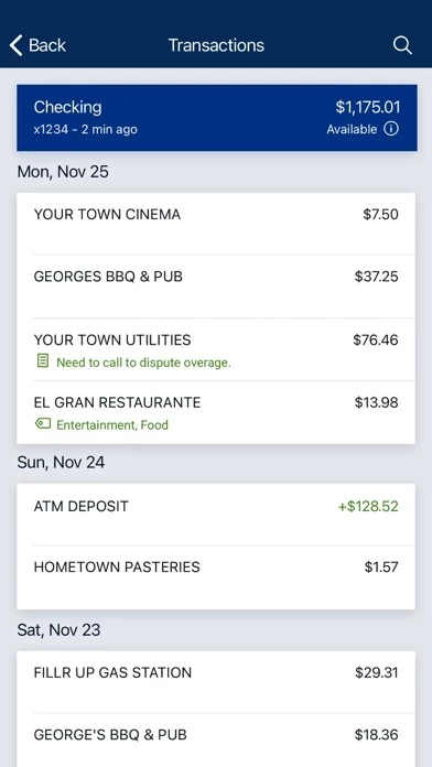
I appreciate the effort to try something new. But in this case I feel as if they shouldn’t have changed the straightforward single page app they used to have. Too many clicks and taps to get anywhere, accounts don’t have names when doing transfers. Loans and other items don’t have the due date on them, you have to click on it and scroll to check, it also doesn’t have the payment amount up front. When you make a payment it fills the amount for you. Overall it’s overthought and too crowded. Too many options pages and taps. Frankly I don’t like It and wish we still had the older one.
Update:
I don’t know how long it’s been now that I’ve had DowCreditUnionBanking , but my opinion has not improved. As a younger person who grew up with tech in my hand, I thought using DowCreditUnionBanking and working with it would make it easier to use. I was wrong. I’m still frustrated and irritated with how difficult even the simplest tasks are. It has a very user unfriendly interface, there’s just too much! All I want to see are my account balances, transfers and due dates, I don’t want to see “similar transactions” and such. Just be simple. I hope they didn’t pay too much to have DowCreditUnionBanking made. I’d be demanding my money back.


