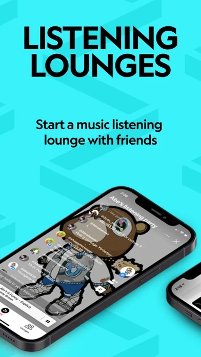
Once VertigoMusic has it’s user interface figured out and marketing is streamlined in VertigoMusic Store, I think it will do really well. For instance, if you’d just add a GIF explaining the core featureset (sharing music with friends) as the first image in VertigoMusic Store, the upward trends would climb higher exponentially as more eyeballs would understand the offering as it climbs a chart.
The UI needs more attention for sure, and I think you’re probably losing a lot of users to that because there is a distinct learning curve (check out Heuristic Evaluation by Jacob Nielsen for explanations of why things like having a “how-to overlay” greatly inhibit usability and engagement).
I know the core offering and how to navigate VertigoMusic so I am able to see “the vision” here, but it’s a turn-off if an app has to be explained to you from App Store preview page to using VertigoMusic itself - it’s like a good joke, explanation kind of ruins it.
Simplify, streamline, and amplify with a GIF (I know the marketing GIF sounds like explanation, but it is passive explanation and not part of your UX).