Your recent additions to the Linux Desktop client is to add a "Read more" button, which is absolutely unacceptable!
_I_ Am to be the one who decides how much and what manner of my messages are displayed.
Your tomfoolery with fonts, 'themes', and [foolish] "minimalistic" (i.e., cheapskate) GUI is finally culminating in something that is completely unusable forthcoming.
PLEASE either remove permanently, or OPTIONALLY ENABLE the "Read more" button, to prevent your program from being added to the "infinitely scrolling" masses of low-quality software people are forced to endure.
New addition "feature" also: when you type a message, the focus goes ALL THE WAY DOWN TO the bottom of the NEW MESSAGES, AND MARKS ALL MESSAGES AS READ! How moronic!
If it weren't a foreshadowing of what is to come already : you've MOVED KEY FEATURES from the Desktop client to the mobile phone. This is unacceptable! All features should be allowed on both platforms, and while I'm at it, a cellular telephone is not someone's identity-- so stop treating it as such, society! The only identity, is by definition, "you" and nothing else. Hence, stop making the Desktop client as a second-class citizen, and make a way for it to be the only minimum bar needed to enter: no cell phone number needed to join.
Additionally: stop wasting time on useless animations and GUI beautifications: focus on usability and customization options! That's what hardcore computer application users truly crave!
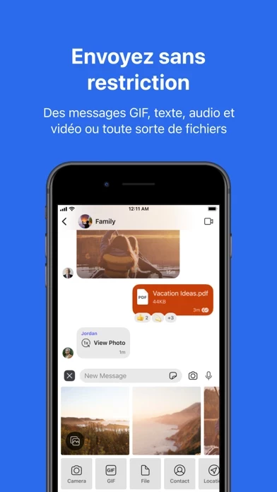
Like, for instance, your Emoticon/Emoji sub-menu, that has your prescribed most-popularly used emoji's. It's pitiful. Replace that with straight-up a customized, editable, menu of the most frequently used list that pops up after a few clicks (yes, a few clicks, since only one can be assigned per message). What I want to see is an arbitrarily long list of my definition of its size, and can change the order or pin certain ones to the top of the list. No prescription needed: just the ones I want, all the time, at the top, and the rest can rotate via frequency, or scroll down to have the previously defined static categories.
GUI Fading wastes CPU cycles and GPU cycles!


