PLEASE NEXTIVA READ THIS HONEST REVIEW!!
I used the Nextiva app all day, every day and it is the most difficult call/chat app I have ever used.
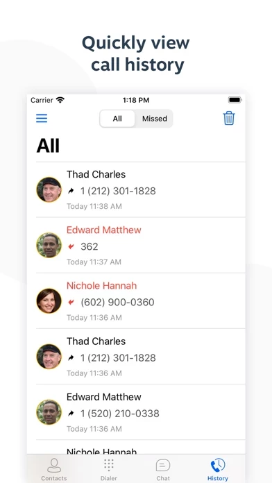
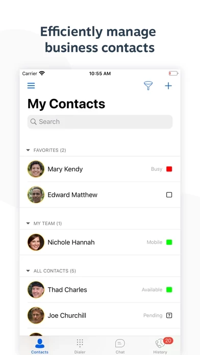
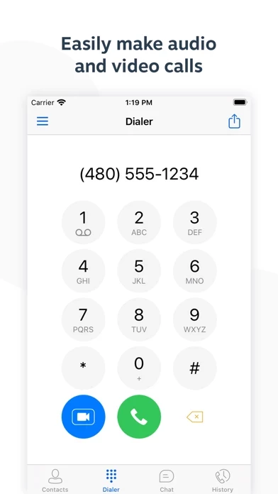
NextivaApp ’s calling platform used to resemble the iPhone platform which displayed the “contacts”, “dial pad”, “recent calls”, etc. along the bottom so it was easily available at all times. Now every time I want to make a call (which is over 50+ a day), I have to manually click to the left, select dial pad and type in the number. What’s worse is that with the newest update, I have to do this step after every call because the default page is the messaging portion. Why can’t it stay in the dial pad screen while I continue to make calls like it used to?
Also during the call, they hid all of the buttons to use the “dial pad”, “transfer”, “merge”, etc. and instead left a huge, ugly, plain white screen.
I could get past the fact that NextivaApp glitches, hangs up on calls, has terrible sound quality most of the time, and all the other annoying things with NextivaApp if they didn’t keep doing updates that make it user-UN-friendly.
Please reach out if you actually care and want more in depth feedback!! Do you even use a User Researcher to get feedback on what your clients actually want or do you make decisions on a whim because you think this is what we want?

