I hated using the Babylist Registry. After buying gifts for an upcoming baby shower (which took frustratingly long) I spent just as much time searching for where I could leave a review. Sounds like the registry is good for future parents but not for those who want to buy them gifts.
What I didn’t like:
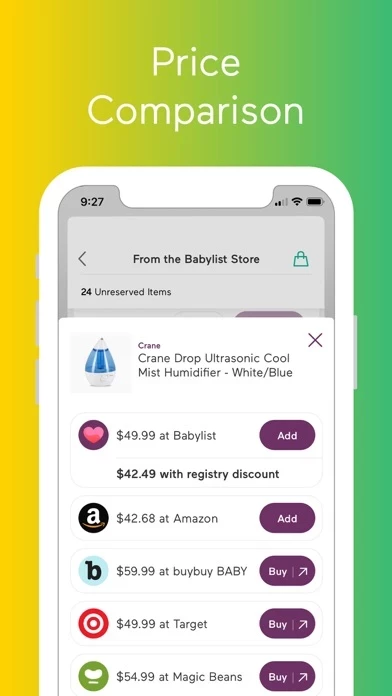
1. Babylist boasts that it offers price comparisons for everything on the list. I’m guessing this is only applicable if an item is available at multiple stores as very few items on the list had corresponding prices. I was clicking blindly and opening new windows looking items up to even see how much they cost and if they were in budget.
2. Couldn’t sort by price, (couldn’t even see the prices) could only sort by under 50, 50-100, and 100plus. Still ticked off about not being able to see the prices.
3. Lots of items were reserved however I can see where the registry would loose users because it’s so tedious, and imagine that many reserved items ended up unpurchased and reserved forever.
4. When you select an item, depending on the store it would show delivery options. The recipients zip code seemed to come up, but on checkout you had to fill in all the address details. Feel like touting an online baby registry in one place should at least show the address or auto fill the address. I dropped off here because I didn’t have it on me.
5. Super tedious process that went something like: scroll through list with no prices, click onto individual items (opens in the same window instead of new window) to check prices, realise the list window is gone, hit back to get back to list, if you see something you like and want to buy you go back to the list to hit “reserve,” again open the item to buy, go back to the list to continue shopping, etc. I ended up just opening every single item in new tabs and having 100 windows open. When you purchase, even if you are buying from the same store you’re opening in separate baskets, so I added all the target items in separate windows and the refreshed the page to get one checkout. Let’s just say that there’s no way my mom could have figured this out on her own. THEN you have to go in and mark your items from reserved to purchased.
6. Changing items from reserved to purchased is a pain and i almost didn’t do it. If you buy 4 items you have to input your details, the order number, the store (shouldn’t this be auto?), who the gift is from, and a gift message, FOUR SEPARATE TIMES. Even if you have bought all four items from the same store.
All in all a super frustrating experience, would not recommend, and it made me want to rip my hair out. I hope the recipient enjoys the gifts and doesn’t just end up with a list full of reserved and Unpurchased items. I couldn’t see a location to view all the purchased items either to make a judgement call on whether she had received all clothing items and no diapers for example, just endless reserves. Maybe no one completed the process because it was so annoying.
Anyway, if I am ever sent a link to babylist again I’m going to immediately purchase a gift card instead. Horrible user experience. But it doesn’t really matter if the user experience for parents is great, because they will keep using it (unless they get frustrated by the reservation process, but by then it will be too late.) Babylist has a lot of work to do.


