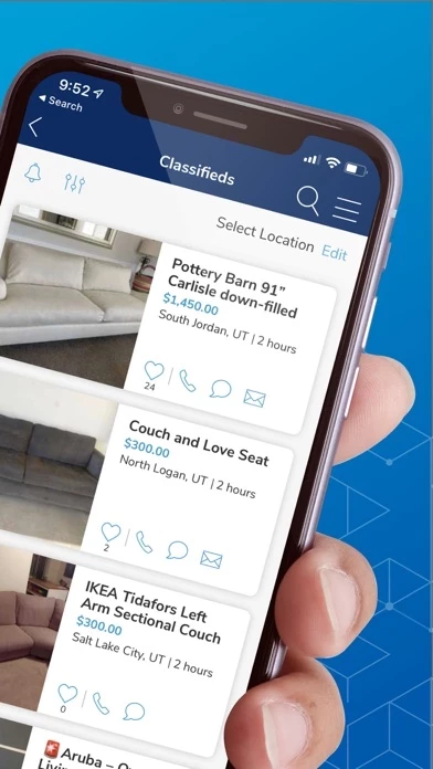
I LOVE KSL Classifieds! Use it literally everyday, without fail. But… this new update has made things awful! The tabs we use most often are now at the tippy top of the screen, yet our fingers sit near the bottom. Why wouldn’t you think to nest the row of navigation tabs at the bottom, and get rid of the terrible ads (usually R.C. Willy) that sit there instead? Or sit right above the ad? The idea of the home page being customisable is nice, but by moving the nav tabs to the top it’s created a less convenient setup, especially if you’re someone who likes to use a single hand with a large display phone.
Also… Dark Mode! Where is Dark Mode??? KSLClassifieds is still rocking the crazy bright white background, where most all other apps have been able to come up with a dark mode option. I’m literally typing this review on KSLClassifieds Store in Dark Mode with white (super easy to read) text. This cannot be that difficult of an option to include, no?
We LOVE the KSL Classifieds system, as it’s far better than Craigslist, LetGo, FB, etc., but it NEEDS a Dark Mode, and would be much more convenient with the nav tabs at the bottom instead of the very top of the screen!