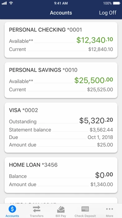
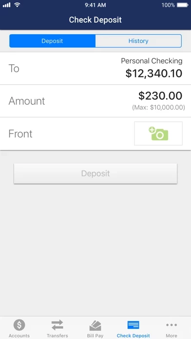
RaveFinancial isn’t too bad, feels more clean and modern then the last. But mobile depositing, which is one of my most frequently used features, seems to have been an afterthought. It’s hidden in the “more” tab where it takes searching to find, not right on the front page as it used to be. Also the experience going through the mobile deposit is much more time intensive. Now you must manually input the amount on the check, rather then it scanning and inputting it for you, then letting you edit it if it made a mistake (which it never did for me in the years of me using it). Another thing is the blurry image with instructions covering the camera so you can’t even see if the check is lining up properly. Lastly, if you have for the passed several years required people to write for mobile deposit only, please clarify if with the new system we need to continue doing this, or not. Because new users wouldn’t know to do it, and repeating users might do it when there is no need to.