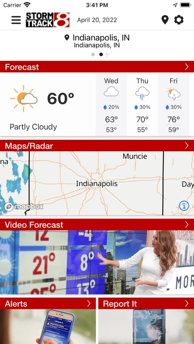
The home screen on this new app is mostly an ad with a small space for the current temperature. I have to navigate to another page to see the current temperature with the "feels like" temperature. On the old app I could see all that information together as soon as I opened it. There is no place on WISHTVStormTrack8Weather to see the eight-day forecast at a glance. I have to scroll and scroll and scroll... and scroll through a looooooong page and all the daily descriptions. The radar looks terrible. It looks faded and is difficult to discern the different levels of precipitation and storm strength. The time stamp is even difficult to read. There is no easy way to see the future radar. I have to pull up a separate menu and navigate through a bunch of other options to do so. In the old app I could easily switch from the current radar to the future projection on the same screen with just a quick tap. On the hourly forecast, I can't see the temperature, chance of precipitation and wind at the same time, I have to tap on them individually. In the old app, all of that information was together at a glance.
This new app seems like just a change for the sake of change. The old app was great, and I used it daily (often multiple times a day). I'm sure it could have used some tweaks here and there, but to completely revamp it was totally unnecessary (and it didn't work out so well the last time you tried it)! It's the Wish-TV equivalent of Windows 8: "Let's take all the information that you used to be able to see quickly and easily and hide it under layers of navigation to make you guess where it is now." Not such a great idea!
So to sum up, this new app is not user friendly, and if you are going to completely get rid of the old one then I will be looking for alternatives in WISHTVStormTrack8Weather Store.