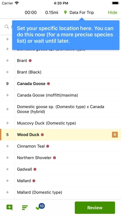
Where this app soars is in the database and region packs. I’m in Mexico so downloaded the Mexico pack. This, combined with the global contributions from others, makes eBird worth it. However, the user experience of eBird is quite poor. Having a smooth user experience clearly isn’t a priority. This probably hinders the quality/quantity of the data itself, as I’m sure it turns people away. For example, when you search a hotspot list (e.g. “hawk”), the search is cleared when you try to scroll down the filtered list, so you see the full list, rendering search useless except for the top 3-4 hits (depending on screen size). Also, you cannot actually see information about birds in eBird . You can only see metadata for sightings (common name, time & location). For information about birds (photos, range map, etc.) you need another app; Merlin Bird ID is good for that, and links to this app). Dear Cornell bird lab: please apply for a grant to up your UX game!