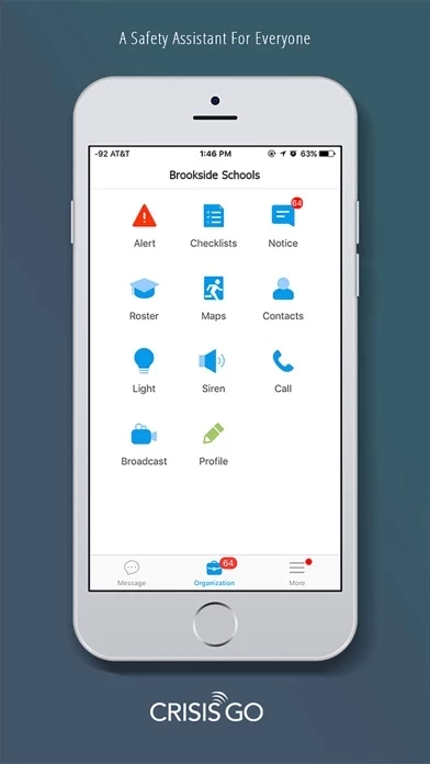
In an actual crisis, I'd really prefer a better app. The user interface and UX are so convoluted and non-intuitive that CrisisGo could exacerbate things in a real situation. The audio alerts and various dings for events happen even during a hide-in-place situation. Basically, when you're doing your best to be as silent and alert as possible, your phone can give away your position. What kind of a benefit is that?!? (Hopefully, they’ve fixed this oversight by now.) During a drill, if it takes 15 clicks, taps, and swipes, to do a task, it's annoying, but won't cost lives. In a real scenario, it should be more intuitive and simple. If the programmers and app designers consulted with any real classroom teachers, they need more data points and feedback. Think about it: if there are only a half-dozen drills a year and each time teachers find it a challenge to use CrisisGo , then how will things go when the adrenaline is pumping, you and three other students are injured, and there are real-life consequences if you can't find little Timmy? It's barely more effective than holding up red, yellow, and green laminated cards across a quad.