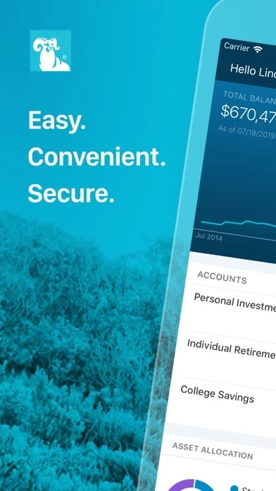
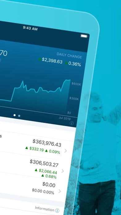
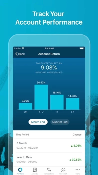
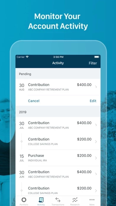
I’m new to T Rowe Price. After changing employers, this is where my new workplace retirement savings is managed. I love the funds available to me and customer support is great but both the web and app user experience are really limiting. First, any activity in your account (contributions, fees, dividends, etc.) all appear in one long stream-of-consciousness feed with no clear indicator of a + or - to your total balance. In some cases it’s not clear if something lost or gained you money, which is pretty darn important if you’re trying to manage your investments. Second, the trajectory graphs are really misleading in that when you make a regular contribution, they’ll spike and depict what appears to be a really good day in the markets, but this is really just your regular contribution posted to your accounts. It’d be more helpful if these charts indicated market performance, rather than market performance + money I’m adding to my account. +110% is not accurate if my deposit accounted for +200% and markets were actually down so the day was a net loss. Third, it’d be helpful to have more in app reporting - or at minimum- some filters that allow end users to breakdown specific activities by timeframe. Lastly, I’d love an option to quickly reference the prospectuses of the funds in which I’m investing. Right now it takes a few clicks to get there, but quick, easy access would be fantastic!