Nonogram com Color Reviews
Published by Easybrain Ltd on 2026-06-05🏷️ About: Discover the mystery of Nonogram.com Color! With its enhanced gameplay, it's easy to follow the game rules and become a Nonogram master.

🏷️ About: Discover the mystery of Nonogram.com Color! With its enhanced gameplay, it's easy to follow the game rules and become a Nonogram master.


We Investigate the app owner's website (Easybrain.com), verify their legitimacy, and uncover hidden scams and complaints.
Edit: this developer consistently makes updates that are counter-intuitive to the user experience. If you play both the black and white game and the color game, you’ll know that if you leave a puzzle in the middle there is an option to either continue or restart. In the original black and white game, the continue button it on top, and the restart button is on the bottom, while in this game they’ve inexplicably reversed it, so if you play a lot and by muscle memory you’re going to be completely screwed in this game and constantly restarting things you didn’t intend to. It’s IMMENSELY frustrating and not at all necessary. Just another in a series of puzzling decisions that make me wonder who is designing their UX, or if they actually play their own games.
This is a great update to the black and white game. The color totally fixes my main issue with their first game (which is that it’s hard to see whether you have the X or the block selected, and clicking on the toggle switches you automatically, even if you wanted the one you were already on). With this one, because it’s color, you select the color and the block type, so it’s much easier to tell, and the toggle function doesn’t automatically switch back and forth. Perfect update.
This game has issues. Some, the developer appears to be trying to fix, and some are the result of stupid developer decisions. With updates, they seem to mostly balance each other out.
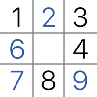
First, kudos for fixing one huge issue: white numbers on light backgrounds. It only took a year, and 40,000 reviews saying the same thing, but at least light box colors now have dark numbers instead.
However, the colors are utterly ridiculous. Some levels have two or three shades of a particular color. Or both dark blue and dark black, with very little visual distinction between them. Having three different shades of ‘orange’ and three different shades of red in the same puzzle is infuriating.
But the most annoying thing is that a recent update made the selected color switch when the total number of boxes of a particular shade hits the expected number of boxes of that color. Yet there’s no countdown for the color, and this behavior makes it extremely difficult to fix bad boxes, since the color is constantly changing, almost randomly. This behavior change has made the game nearly unplayable.
Oh, and the whole idea of the puzzles forming pictures is stupid. Just make puzzles, and stop trying to pretend that a 10x10 or 15x15 bitmap gives a ‘picture.’
I love Nonograms, and the black and white version is my favorite mobile game. I have been looking for a good color option and was excited to come across this one by the same developer, I was so disappointed to open it and realize that i cant choose a difficulty level on this one, i don’t even want to play it anymore. Forcing people to do puzzles that are too easy for them takes the fun out of the game. I only like doing hard nonograms, and it’s unfair that i would have to go through so many easy and medium ones just to get to what i downloaded the game for in the first place. So, unfortunately i’ll have to delete this and stick to b&w for now, but i’d love to give this another try after an update where we can choose our difficulty level.
5/2: Please allow users the option to choose what difficulty level they want to play. I only want to play the hard levels.
4/27 REVIEW UPDATE: Thank you for making the color updates! It’s SO much easier to read now. One update I do not like, though, is that the colors disappear when you’ve completed them. Only, sometimes you can hit a square on accident or realize a mistake but then you have to click a whole lot of other squares to get the color option back. Please at least make this an OPTIONAL function at the very least.
ORIGINAL: To the developers: please reference ADA color contrast and size requirements for web. I have good eyesight but the white numbers on the colors are very difficult to read, especially the white on yellow. Picture Cross on the Puzzle Page app is MUCH easier to read.
I love the logic and reasoning part of the game, however some of the colors used are hard to discern. Please put the numbers in black, if you need to fill the box with a lighter color. For example, I lost more lives than I care because the number written in white against a light yellow background are hard to read. I have had the same issue with light pink and white, although yellow and white are probably the worst combo. My other suggestion would be to please allow to magnify a section of the puzzle especially for complex ones. Since the squares are really small, I accidentally went a square ahead than I meant to and lost lives while playing the game from my mobile. Unless, these issues are fixed, I’ll probably take a break from this game as trying to read the numbers against a light background is becoming a sheer torture for my eyes.
I mostly like this, but I have two big issues with it that make me less interested in playing it:
1. I’d like to be able to choose a difficulty level, just like in the black-and-white app. Having to go through all the levels in a specified order means having to do a lot of levels that are too easy.
2. Some of the colors are very hard for me to visually distinguish from each other. I’m partly red-green color-blind; for me, that mostly manifests as having a hard time distinguishing between colors that don’t have much contrast. So, for example, in today’s puzzle (April 15, 2021), there’s a dark brown and a black that I can’t easily tell apart. So it would be really helpful if you could provide a color-blindness mode that would use strongly contrasting colors, or even patterns instead of (or in addition to) colors.
I don’t know why I’m going to bother writing this, because the suggestion will go nowhere. I am addicted to the b&w version and decided to give this one a try. It fixes some of the issues from the other, but can be much better. The biggest problem with the game is visibility. It uses rectangles to identify the color, and small white numbers. It’s not terrible with darker colors, but near impossible to read on the yellow and pink. I probably wouldn’t have had the issue when I was younger, but now it’s hard to see the difference between the tiny white 2 and 3 on the yellow background. The font size is much better on the b&w version. Using the larger iPad didn’t help. Would you consider using that larger font, and applying the color to the number instead of having the background?
The other issue is it’s hard to tell the difference between the pink rectangle and the washed out (completed) red. There have been many times I thought I completed squares but found out they were pink after attempting to X them out.
Now that I’m older these are the type of games I like. I can’t help but believe you are losing a large segment of potential users (and ad revenue) by having these usability issues.
I am just about at my wit's end but I'll try one last action to perhaps correct SOMEthing. (0) NonogramcomColor just wiped out my nearly complete comment on what's wrong. (2) Before that, it had taken me to a blank screen when I was seeking the daily. (3) ONLY solution is to have removed NonogramcomColor and reinstalled it. (4) Removing NonogramcomColor means EVERYthing was deleted. (4a) This includes progress on an event and I am sorry to say my increasing understanding that I am not willing to struggle with the same pixelpuzzles over again. And again. And again. (5) With all this there is no way in NonogramcomColor to"reach out" for any assistance. All of what I've written above -- except for item (0) has happened to me more than once. I think my end with this may be near. Prove me wrong!
Please make the numbers bigger, it’s so difficult to see numbers when doing larger puzzles, I often can’t tell if it’s a 6 or an 8 or a 5. I’ve seen many other reviews complaining about the same issue & despite the developer having a similar app with just black squares that has a far superior font and font size, the developer response to others has been that they can’t change the font/size at the moment… why not?!… if you can do it on your previous version, you should be able to do it here as well. It’s VERY frustrating and if it doesn’t change soon, I’ll be deleting NonogramcomColor . Also please make a way to select squares and have to confirm it, the squares are small and I often accidentally select an adjacent square when trying to select squares and lose a heart. Or improve the apps ability to know which square we are trying to select, it seems off currently. Other than that, it’s very fun and addicting… in a good way.
Hello, I’m here to talk about how this game is getting too hard. The game is getting really hard and I keep losing my hearts and I’m almost to the end, so I have to watch I billion adds to play. And some of the adds are really glitchy and send me back to my Home Screen and when I go back to NonogramcomColor , I get sent back two levels! This is starting to happen way too much to the fun Easter bonus games and the regular ones! One more thing, also, when I go back to NonogramcomColor and click on a level, it Immediately makes me go to an add! This is way out of control and I’m tired of it please fix this 🙏. This game may get a lot of good reviews, but most of them are ignoring all the bad things that happen! That was the bad part of this review, this is the good part! The game is totally addictive and fun! I love playing this game whenever I get the time to! Please fix this so I can still enjoy playing the game! Peace out!
I recently installed this game after being an avid B&W player for so long. It’s been great so far, but I have 2 main issues that I feel could be easily fixed. 1. When you finish a row or column, it vibrates and greys out the numbers, but unlike the B&W version, the area where the numbers/colors are doesn’t turn white. I don’t play with auto crosses on because I like to do everything myself, so it can be confusing if I’m going quickly through a level to tell if that row or column is done. In B&W I just look to see if a row or column is white instead of the normal grey color. 2. I’m 101 levels in currently and don’t see a way to choose difficulty? B&W has this option, and I like playing the hard and expert levels. If these issues could be taken care of I feel the game would be perfect for all who play it 👍
I absolutely love this game! I started with regular nonograms and then saw this one was available too and had to try it. I love the concept and that it requires a different strategy. I look forward to midnight when the daily puzzle is available and I look forward to the events (I’m aware, I live a sad life, lol)
However, I have red-green colorblindness. This makes the puzzles a little more difficult. Thankfully I paid for NonogramcomColor so when I screw up on the colors, it doesn’t affect me too bad. One suggestion to make NonogramcomColor more pleasing to my eye (and possibly everyone else’s, as the numbers/blocks are quite small), it would help if the colors on the side/top of the puzzle could be highlighted when choosing the colors at the bottom of the puzzle. (For reference, the colored nonograms in the Puzzle Page app does this). It makes the color choices more clear and thus fewer mistakes.
Thank you for listening to my review! I seriously love NonogramcomColor.
This is by far the best color picross/Nonogram game that I have found in NonogramcomColor Store (and I have tried a LOT) I especially appreciate the option for a one time payment to remove all ads (I wish I could give the devs more money because I have definitely got more value out of this game than I paid)
My only criticism is that the game desperately needs a colorblind mode. Perhaps add options for different types of color blindness e.g. deuteranomaly mode that differentiates red from green and blue from purple; or a universal colorblind mode that adds symbols to differentiate colors. Right now I can play most puzzles without problems but red/green ones can only be solved by using the color invert option that is built into iOS. A native colorblind option would be greatly appreciated!
I hope this makes sense but, If I’m filling in by color math, basically one color at a time in different lines, when I’ve colored in the allotted spaces, the number in the group that tells you how many blocks that color is doesn’t get shaded all the time. It makes it difficult and frustrating because I end up clicking on the next tile in the same line with a new color then I get a loss as if it will only shade the colored numbers if I fill in the whole line in when that’s not true. It inaccurate when I’m trying to fill the board by color only and the sides don’t shade in when I’ve finished that color.
Other than that the pictures are very subjective sometimes but it a a cute game that hurts my brain sometimes lol 🧠 ⚡️
This game is pretty and bright. Second thing I like is the fun of gradually discovering each picture. Also the logic required is a fun challenge.
Unfortunately, the buttons used for filling in colors or X (no color) I find non-intuitive. I have made dozens of errors. It because of bad logic, but because the button was set to an unexpected combination of color and function.
You have to tap colors to “load” the two-state button and switch the button to the right state. Get part of that wrong before touching the picture, and it dings you! To make it worse, the game also switches color and button state without the player making that choice.
You’ll find yourself thinking “That’s not what I asked for! Why did it do that?”
Far better would have been one button for each color plus one button for X. Tap the color or X you want to place and tap the board where you want to place it.
Maybe this was designed this was to be sneaky and make us screw up more and watch more ads (yay more ad revenue for you right?) but the board game on the hard levels is small. And my phone screen isn’t small. I use a stylus so I can click the correct square but MANY times I accidentally hit the square next to the one I intend on and lose a life.
That’s super frustrating to me because I KNOW which square I was going for but I clicked the wrong one. After doing it so many times, I get frustrated and give up on the game.
And did you know you put a cap on how many ads you can watch on a certain game board? It’s happened a lot because of this “I clicked the one next to the one I intended” thing that happens frequently.
Maybe you should allow us to zoom in on a specific part of the board. But then we’d make less mistakes and would be watching less ads.
Bad idea for you, right?
You’ll get 4 stars from me until I quick clicking the wrong squares and can zoom in to be more accurate. But we all know you won’t do that because more accuracy for us means less ads for you!!!!
I’m not stupid. I just want others to know why you won’t fix things. We screw up and you get more ad revenue! Yay for you!
I have only played this game for a few days, but I have already found it pretty addicting. Reading the other views I reciprocate the need for a dark mode version, but that isn’t my main concern.
After a couple times after playing the game and switching to other apps, or the home screen, I find that there’s a weird outline or shadow in background. I uninstalled and downloaded NonogramcomColor again to see if it would leave, but it is still there. I have rebooted NonogramcomColor , shut off my device, and I don’t know if it will leave. Maybe it’s just my device, there’s a possibility that it could be the game as well. Is it just me? (But besides this, the game is great!)
I love NonogramcomColor! It’s probably the best color nonogram game I’ve ever played. Only thing I would suggest is adding a dark mode option. My favorite time to play this is at night, but the bright white background makes it straining on the eyes and the lighter colors blend in with the background or with each other when I have the brightness down. Other color games with a dark mode help me differentiate the color a lot better than the white background.
Just a suggestion, I have no idea how hard it would be to implement, and not having it doesn’t take much away from NonogramcomColor , but it would definitely make NonogramcomColor so much better to have a dark mode option.
First of all the game is really good. I have the black and white version and this and both are really fun.
HOWEVER, in this game especially I like to block out areas where I know the color will have to be (like if theres only 4 segments of yellow on the top and sides I like to make a square around it with a different color so that I can concentrate better). The problem with this is I cant do it after I get 2-3 colors done because then the colors will bleed through and I wont know what is a square and what is actually meant to be there.
So my suggestion! Could yall please add a separate color in every puzzle that isnt actually in the puzzle but we can use it to block out areas? I play on classic so I dont have the 3 lives to worry about but Im sure yall can figure out a way to not make it interfere.
For a long time I didn’t enjoy games like these, however after playing this game and understanding it I absolutely love it! I played from 10am on 7/7 until 3:30am on 7/8 and completed the month of June puzzle! Only have a couple complaints. 1.The game really lags on daily challenges and the events after playing a few boards. 2. I don’t mind the ads however the only I think the only time an ad should pop up is if you choose to get an extra life and no ads if you choose to restart the board. 3. The only other thing I wish the game has was a way to earn hints in the game. Other than that I absolutely love this game!
Nonogram.com Color: Logic Game is very safe to use.
JustUseApp Safety Score for Nonogram com Color is 76.4/100.
This assessment is based on our NLP analysis of 25,178 user reviews.
Combined with the app store average rating of 4.7/5.
Nonogram.com Color: Logic Game looks authentic and legitimate.
Our NLP models processed user feedback to estimate legitimacy. JustUseApp Legitimacy Score for Nonogram com Color is 77.4/100 .
This conclusion is based on analysis of 25,178 user reviews.
Discover the mystery of Nonogram.com Color! With its enhanced gameplay, it's easy to follow the game rules and become a Nonogram master.
Explore Nonogram.com Color and discover a fresh take on this classic paper-and-pencil nonogram puzzle.
Nonogram.com Color is easy to learn and quite addictive once you start playing.
Start with the basic rules and logic behind the picture cross puzzle with a challenging multicolor style.