Congratulations to the this app team on finally releasing an official app for the iPhone. Third party apps have only been available for at least two years so I'm happy to see you staying current.
My favorite part of BIXI was when I opened it for the first time and it asked for access to my location which I granted. Guess what it asked next? Which city's bike service I want to use, even though I was standing three feet away from a bike station in Montreal. The start page has seven icons, only three are actually useful and of course they can't be rearranged or removed. Things don't get better at this point. Both the Telus and SkyMotion items open Safari, i.e. take me out of the this app app. Would it have been so hard to build a browser into BIXI like thousands of other apps seem to do? The Settings item only has one setting, which city's service I want to use. The About should really have been buried under Settings. this app Perks actually sounds cool until you open it up and see that there are only six participating businesses in Montreal. Honestly six isn't even worth bothering with, what was the sales team doing all winter?
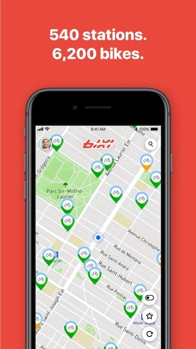
The two important items List and Map are simply different ways of viewing the same information. One item would have been fine especially since there's already a toggle once you are viewing the stations. Much like the 3rd party apps there is a list of stations which can also be viewed on a map, all sorted by proximity to you. All the other apps manage to display both available bikes and available docks at one time with requiring me to toggle between them, why can't you do that? What's up with the Timer function in the station list, shouldn't that be a separate icon on the home screen? Max time is 60 minutes and can only be set in 15 min increments, seems far too limited.
Now on the this app website there is a map with six different colors of pins representing things. On the website, red pins represent "In Service" from BIXI , red pins with an X represent "unavailable stations". From BIXI , green pins represent functional stations with bikes or docks available depending on what you are viewing, meanwhile on the website, green pins represent Communauto stations. "To Come", "Sponsored", "Special Event", "Blocked" and "Communauto" indications simply don't exist in BIXI .
Let's pause for a moment and exit BIXI and head over to the Settins app. Scroll through the list of apps and you'll see this app there. Opening that up allows you to select a city. I can select New York or Chattanooga even though neither of those cities are available from within BIXI , and neither of them is the city I'd like. I was originally looking for a way to change the language of BIXI to French, but apparently that's not possible.
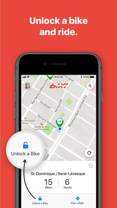
Since the main purpose of BIXI is to find this app bikes, shouldn't BIXI launch into the Station list? Or perhaps launch to where I was when I last exited BIXI ? How about giving me a basic intro on this app, especially important for the tourists so they don't have to try to decipher the instructions on the station computers. How about letting me pay for this app service within BIXI and just display my 4-digit code on my phone? As a this app subscriber, why can't I log into my this app account and see the same information that I see when I use the website? There's also no link to the this app website, there's no News section displaying recent blog entries. There's nothing linking to the this app Facebook or Twitter accounts, there's nothing providing info about becoming a member or trying to sell a membership to me. There's nothing for the this app store either.
Overall what would have been considered a poor app three years ago now looks downright disgraceful for an "official" app. I really hope something more substantial and better conceived is coming in the near future.