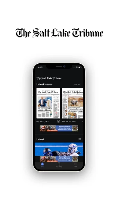
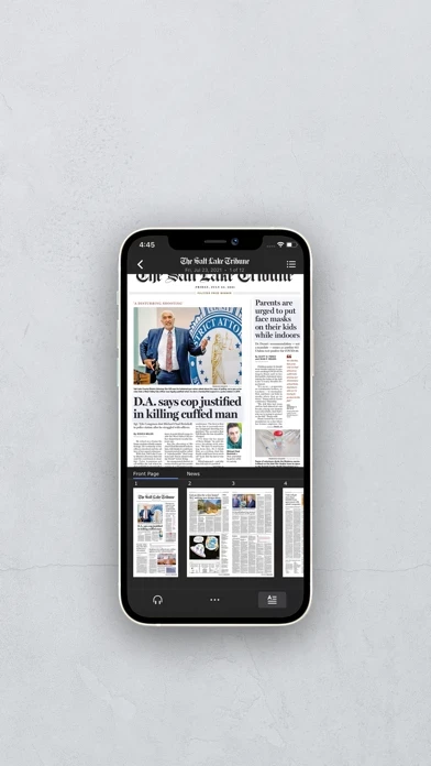
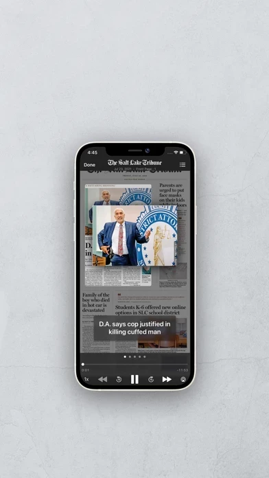
I cannot fathom why the tribune felt the need to transition from the old, black app, to this new red one. It’s a huge downgrade in every aspect. A short list of just a few of the problems:
•TheSaltLakeTribune ’s design is terrible. It doesn’t look or feel like an iPhone app, and doesn’t follow iOS conventions. For example, swiping to go back after opening an article doesn’t go back, but goes to another article for some reason.
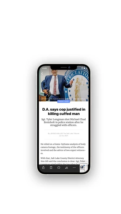
•Constant UI bugs and glitches. Floating navigation bars (or just solid white bars because the buttons don’t load), missing buttons, freezes. This even extends to the articles, frequently entire portions of articles simply never render, forcing me to find the article on the web.
•Notification bugs. Almost daily I will receive duplicate notifications, or four to five notifications in rapid succession. Even after turning off the notification for a new “e edition” of the paper, I still get it almost every day.
Overall it’s just a mess of an app that is terrible to use. I feel bad that the Trib paid to have this made because it reflects terribly on their brand. Hopefully it can improve, but based on how long TheSaltLakeTribune has been around, I’m not expecting much.


