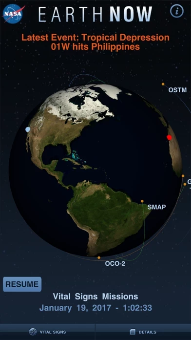
EarthNow is designed to display several data maps gathered via satellite.
These data maps include everything from ozone, carbon dioxide & monoxide levels, to gravity field variations.
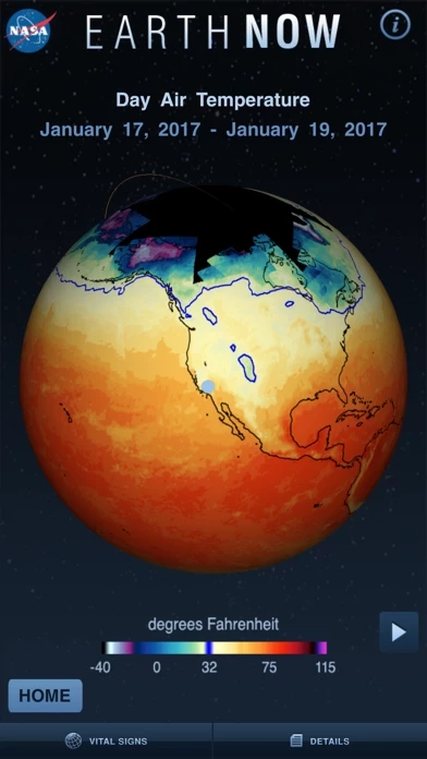
Animated data maps can also be displayed, showing changes over time.
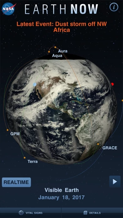
All of these maps are rendered in false color tones projected onto a globe. The globe can be rotated but is locked at the poles; you can't turn the whole geoid upside down.
Zooming in and out via multi-touch is very rough, in direct contrast to the silky smooth scrolling iOS and Apple devices are known for. I hope this improves as EarthNow is updated.
Otherwise though, the datasets load very quickly and a details screen can be selected that describes the scale used for the map, the data's importance, and the source of the data.
Improvements I hope to see are:
*Much smoother scrolling, the kind Apple is legendary for
*A higher-resolution globe; the current globe is passable, but pixelated on the Retina Displays, and won't look very good on an iPad
*The ability to control the playback speed of animated data maps, and the ability to scroll through them manually, to see change over time in a specific area of interest, for example
*Additional information on the importance of the displayed data. Many people people (like me) are voracious readers and would love to learn more about the data we're examining
Thanks!