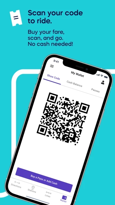
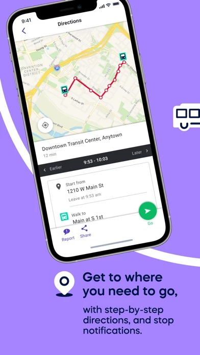
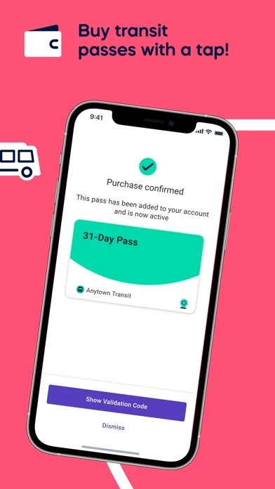
Umo may be having growing pains, but I’m finding it extremely useful and full-featured. It’s clear that the developers have listened to feedback and made improvements to address pain-points in UmoMobility . I have to believe that many of the negative reviews are from folks that missed the in-app notifications that real-time data wasn’t yet available in their neighborhood.
As a software interface professional, I might quibble with some of the minor design decisions made, but all-in-all, I find it quite usable. Regarding the complaints about UmoMobility being too dense, bear in mind that UmoMobility is displaying information for *all* the transportation options in your area, e.g. bus, lightrail, heavyrail/train, ferry, bike, walking, and ride sharing services like Lyft/Uber; that’s eight categories and each of the transit options may have multiple routes. If you want to narrow the choices down, try using the Filter drop-down menu that’s above most lists of route options. Once you find the route or station you’re looking for, you can favorite it so it’s super easy and fast to locate again.
Kudos the the developers for tackling a challenging problem—with tens, if not hundreds of use-cases—and delivering a very accessible and relatively easy-to-use solution.


