I’m able to add my library account, conveniently browse and download available issues, read them using the graphical layout or the text-based reader mode. For that functionality alone, this is one of my favorite apps on my phone - this is how reading is supposed to be - immersive, with purpose and thought, and in depth rather than skimming headlines. That’s what I’m able to do effortlessly, because Flipster enables me to read articles from The Atlantic, or the New Yorker, or whatever magazine I’ve downloaded - and it presents the content beautifully just as the magazine laid it out and there are no flashing ads vying for my attention. Thank you for a wonderful app!
What’s needs improvement:
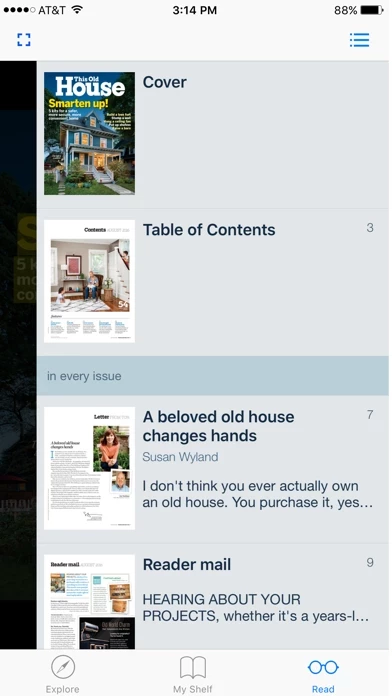
1. The text-based reader mode: currently it only shows text in Arial (or something similar) - font size, font family, background, brightness - none of this can be customized. It’s really critical to improve this. When reading full articles, font readability matters a lot! Fonts with a serif are so much more readable at small screen sizes (or if people feel differently, let them choose their font). Background and brightness can make such a big difference when it comes to eye strain. Adding some configurable options here will turn a good app into a great one!
2. Font scaling and image scaling in graphical view. When zooming in to some pages, the text and images can get blurry quite quickly. I have seen magazine reader apps that do a great job of zooming, and it would be great to get the same experience here. If you have to pick one thing to work on though, I suggest the text reader improvements are a much higher priority.
I do hope you’ll consider my feedback and I promise those 4-stars will turn into 5 as soon as we get some font configuration options. Thank you for a very nice app in the meantime.