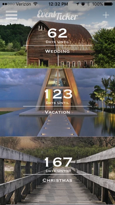
There are a few neat features with EventTicker, such as the swipe-up todo list. However, the poor visual design dominates the system making it fairly unusable at times. It seems this is a result of lazy programming more than anything. For instance, when scrolling backgrounds and choosing a new one, the selection text (save, cancel) is white and stays white, making it impossible to see where these selections can be made. Add a translucent gray box around these words!
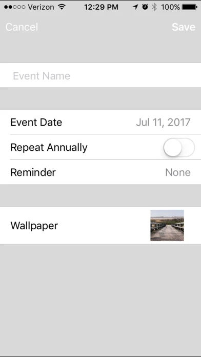
Another example of lazy programming is in the event creation engine. One menu must be closed before another can open by closing the menu and then opening the next. It has been a feature of most menu systems for decades now to be able to click from one to the other without closing the first one.
EventTicker has great potential, the developer just needs to care more!