This latest version is a big step backwards for those like me who read The Week in landscape mode on a 9.7” ipad.
It doesn’t display properly and instead of being like reading a magazine, as in the past.
Amongst the things which annoy me are
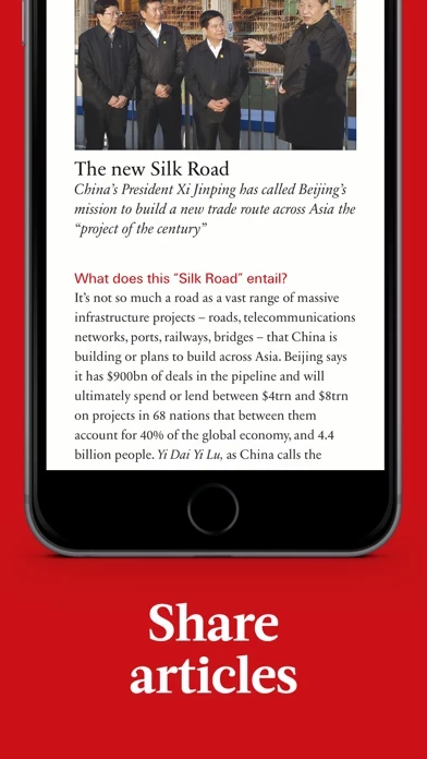
1. For articles with a picture at the start, it takes up a whole screen and you need to scroll down to get to the text
2. there are now completely superfluous “summary” pages at the start of each section, which were surely intended to display as a band on the lhs, but they don’t...
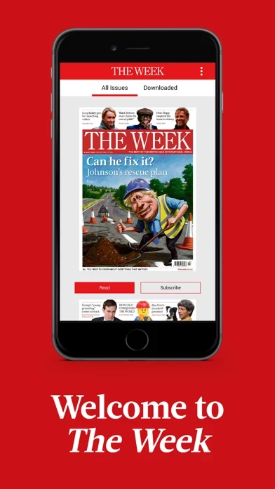
3. Much harder to navigate between issues as each issue is now full size image rather than the vignette style for other than the current issue in the old app. As a result you have to scroll down 2 screens to get to the next issue.
4. The crossword is impossible to do as in landscape mode the virtual keyboard doesn’t fit on the screen (and doesn’t scroll) All the clues don’t fit on the screen & impossible to scroll down to read the missing ones. The only solution is to turn to portrait mode, where only 3 clues show at a time.
It probably looks great on a phone, but that’s not what I use to read it & they have ruined the ipad app experience for me


