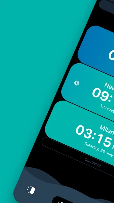
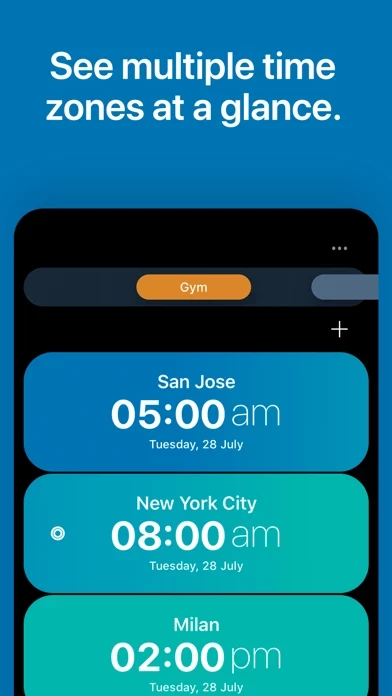
It's somewhat intuitive, but not totally. It does what it needs to, which is show you the "cette application" for the cities of interest you want. On the macOS version, it's sensitive, so be careful when you scroll (move your finger on the magic mouse) left or right for checking the times. You have to memorize what the colors mean (I think it would be nice to have a small code up top to remind you or at the bottom). I don't care for the "flow mode" the worm looking line at teh bottom, but perhaps others do. I do like the concept of what you want to do with that mode though, but another visualization might work better. It easy to add citties and I've foudn even odd named cities, which similar apps don't have.