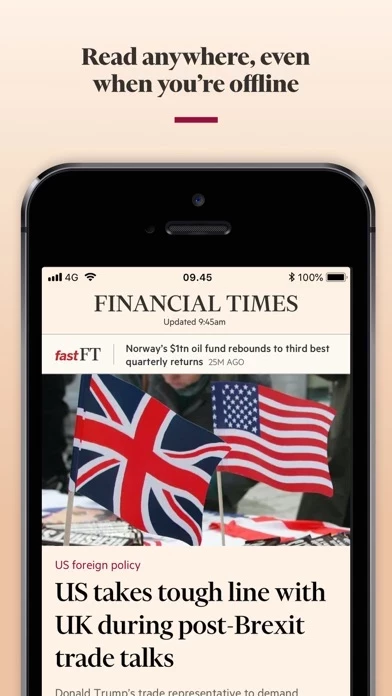
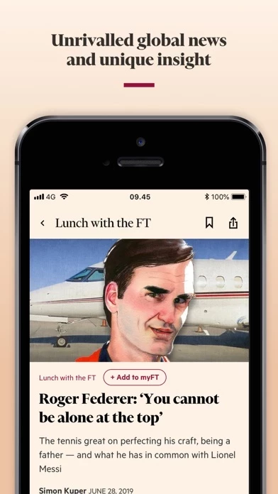
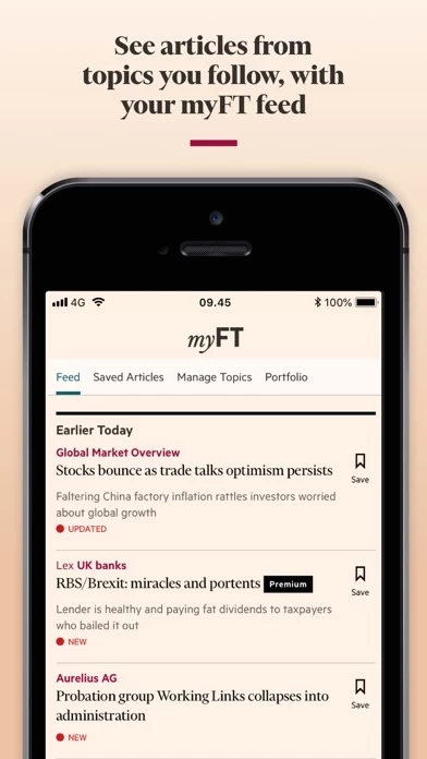
Honestly this app has the poorest user experience I’ve experienced in recent months. Even basic mobile design guidelines have not been implemented.
It’s really too bad because the content is way better than most competitors.
1) fix navigation.
How are users supposed to know they must swipe left and right to navigate? Besides, it’s not a smart system for a news app. Just look at apps like Bloomberg, their navigation is superior thanks to a bottom bar (this is standard practice by the way, and used by leaders like Spotify and Facebook)
2) fix discoverability.
Solving the first point will certainly help with discoverability, but it won’t be enough. The FT produces a lot of content, and you can’t just leave it there and hope users find it. Why is it easier for a Spotify user to find a specific song out of millions than for an FT reader to find an article among a few dozen? You really have to think about this strategically, otherwise users will churn.
3) personalize.
Do you think all readers want to read exactly the same articles? No! For the same reason you probably don’t watch the same Netflix shows as your colleague.
Welcome to the beautiful world of the internet, where AI algorithms produce personalized experiences. Stop thinking about about this app as a mobile version of your paper edition. This is a different product altogether, targeting different audiences. If you don’t personalize (aka if you show me articles about Oil prices when I care about value investing) then users will churn. This should make sense, who wants to see irrelevant content?
You have a wonderful product (your articles) trapped in a horrific prison (your app). For the sake of journalism, please free the innocent


