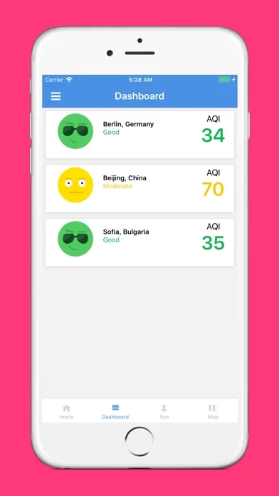
Airlief reports the precise Air Quality Index (AQI*) for your location and plots an Air Pollution Map around you using data from 15000 stations in 73 countries.
Airlief brings you real-time data on air pollution in your area together with useful recommendations and tips that will help you improve your (respiratory) health.
The app combines the real-time air quality data with your personal information to give you the most relevant and timely tips for avoiding excessive pollution or counteracting on it.
The app’s main screen gives you the color coded AQI, showing the level of air pollution, as well as historic data on air quality in the area.
This makes Airlief perfect for most of the citizens that live in big cities and are often exposed to air pollution,And especially necessary for people with respiratory, pulmonary and heart problems.
Airlief pollution map can be used to identify the cleanest areas in the city and help users make the smartest choice about their route.
Airlief now features a totally new, custom map, which shows all air quality sensors in the area around the user.
If the pollution level of the air is moderate to high and it starts raining, about 60 minutes are needed to see a difference.
In cold winter nights without wind there is a higher possibility the air quality to worsen due to temperature inversion.
The higher AQI score the more it damages your health, it especially worse for people who have respiratory, or heart disease.
This is why weather can cause and solve the air pollution problem.
This is an index for reporting an air quality in the most user-friendly and understandable way.
Often the weather can be the cause of air pollution.
As the AQI increases, a large percentage of the population is likely to experience severe adverse health effects.